Some materials whisper. Others shout. Some offer warmth; others, a cool edge. But the real magic happens when two contrasting voices, like velvet and steel, wood and stone or bouclé and leather, sit side by side in harmony.
In interior design, we’re not just creating visual compositions. We’re crafting tactile landscapes. And often, it’s the unexpected material pairings that tell the most memorable stories. That moment when your client runs their hand along a piece and says, “Wait – what is this?” That’s the power of thoughtful contrast!
Keep reading and discover material combinations that make you look (and touch) twice!
It starts with the Sample Box

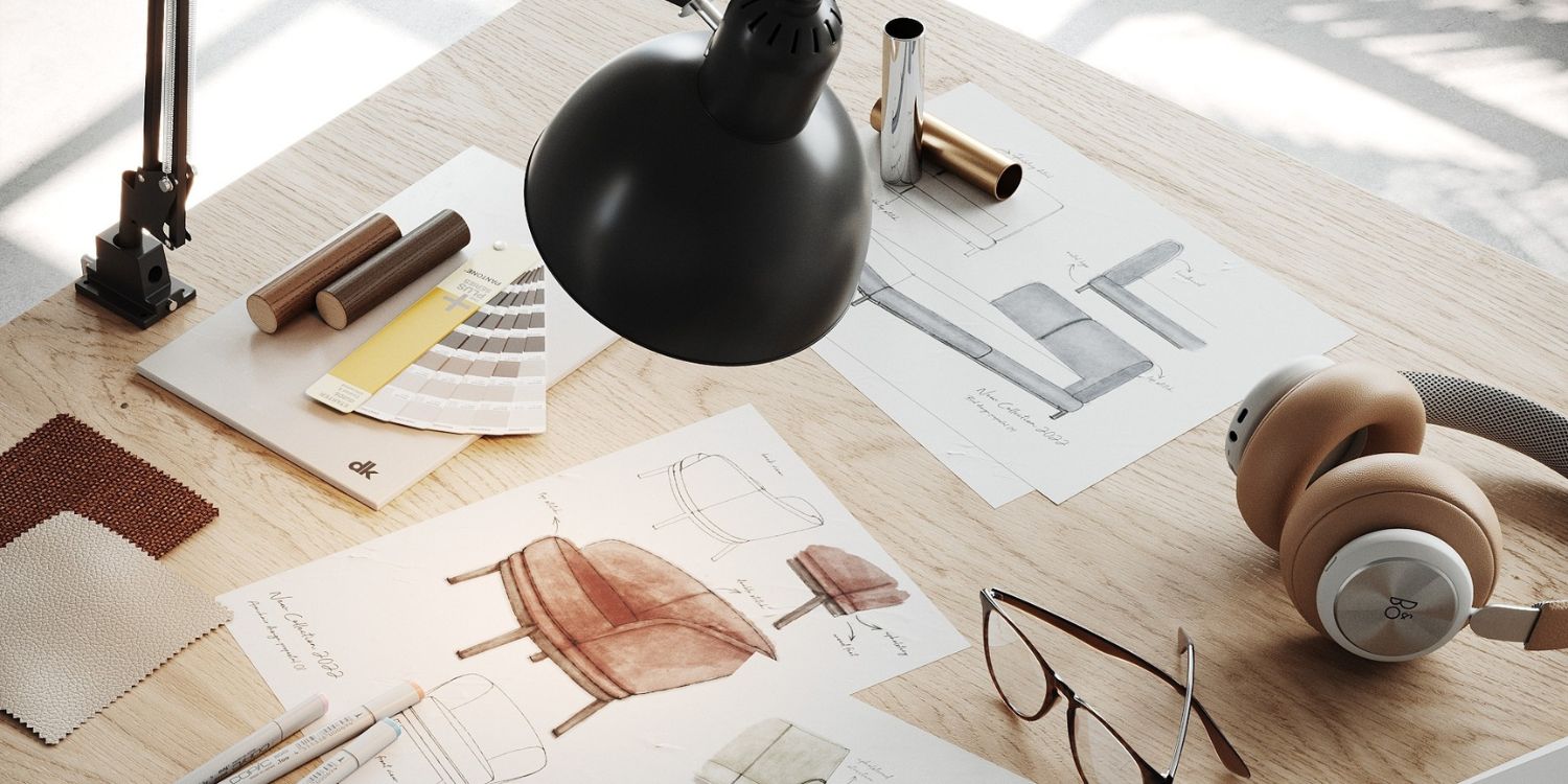
Let’s be honest: we all have our favourite part of the process, and for many of us, it’s the sample box moment. Fabric swatches, metal finishes, wood veneers… it’s like a sensory playground. But it’s also where intuition kicks in.
You might not expect that matte leather would pair beautifully with a high-shine brushed steel, but when you place them side by side, something clicks. It’s a dance of tension and balance – too much contrast feels chaotic; too little, and it falls flat.
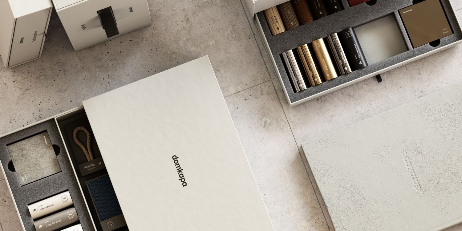
Domkapa’s sample box has everything you need to create exceptional projects. It’s perfect for exploring and trying out our extensive range of high-quality materials and finishes to see how they look together!

Tactility as a design tool

There’s a reason hospitality and residential projects increasingly lean into sensory design. Clients don’t just want beautiful spaces; they want spaces that feel good. Think of the soft resilience of velvet next to the cold honesty of marble. Or the raw edge of burnished metal tempered by the inviting texture of wool.
These aren’t just aesthetic choices. They’re emotional cues.
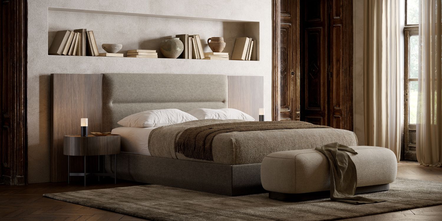
A bed with a plush upholstered headboard, accompanied by rigid wooden bedside tables, gives you comfort and structure. A buttery leather bench perched on a slim, angular wood base says “lounge-worthy” but with architectural confidence. It’s about giving the eye something to explore and the hand something to discover!


Harmony through contrast


There’s a misconception that materials need to match to belong together. In truth, contrast creates curiosity. The key is finding a unifying element – maybe it’s tone, texture or finish. A cool-toned walnut and a beige leather might speak the same colour language. A rustic boucle and texturised steel can read “soft modern” in the right setting.
Designers who master this language of material interplay don’t just build rooms, they build atmospheres.
How to play with material combinations
- Lay it all out: use our sample box like a design lab. Don’t just match by colour – explore by texture, weight and sheen.
- Trust the tension: that slight unease you feel when pairing opposites? It’s often the sweet spot. Let it simmer.
- Design for the hand, not just the eye: consider how a user will interact with each material. Where will they sit, lean or run their hand?
- Consider light: some materials bounce light (metal, glass), others absorb it (matte textiles, wood). Pairing both adds dimension.
- Keep something grounded: when mixing materials, anchor the design with at least one neutral or familiar finish. It gives the contrast room to shine.

The next time you’re specifying a custom piece or curating a room’s palette, ask yourself: What story are these materials telling together? Do they support each other? Challenge each other? Invite interaction?
Because when materials are in conversation, the design becomes experiential. And that’s what turns a good project into a great one!
YOU MAY ALSO LIKE: 5 Trending Materials Defining Interior Design In 2025
We are working every day to bring you the most stylish ideas to fulfil your inspiration and to create the best interior design projects, so feel free to follow our Instagram Page and subscribe to our newsletter.