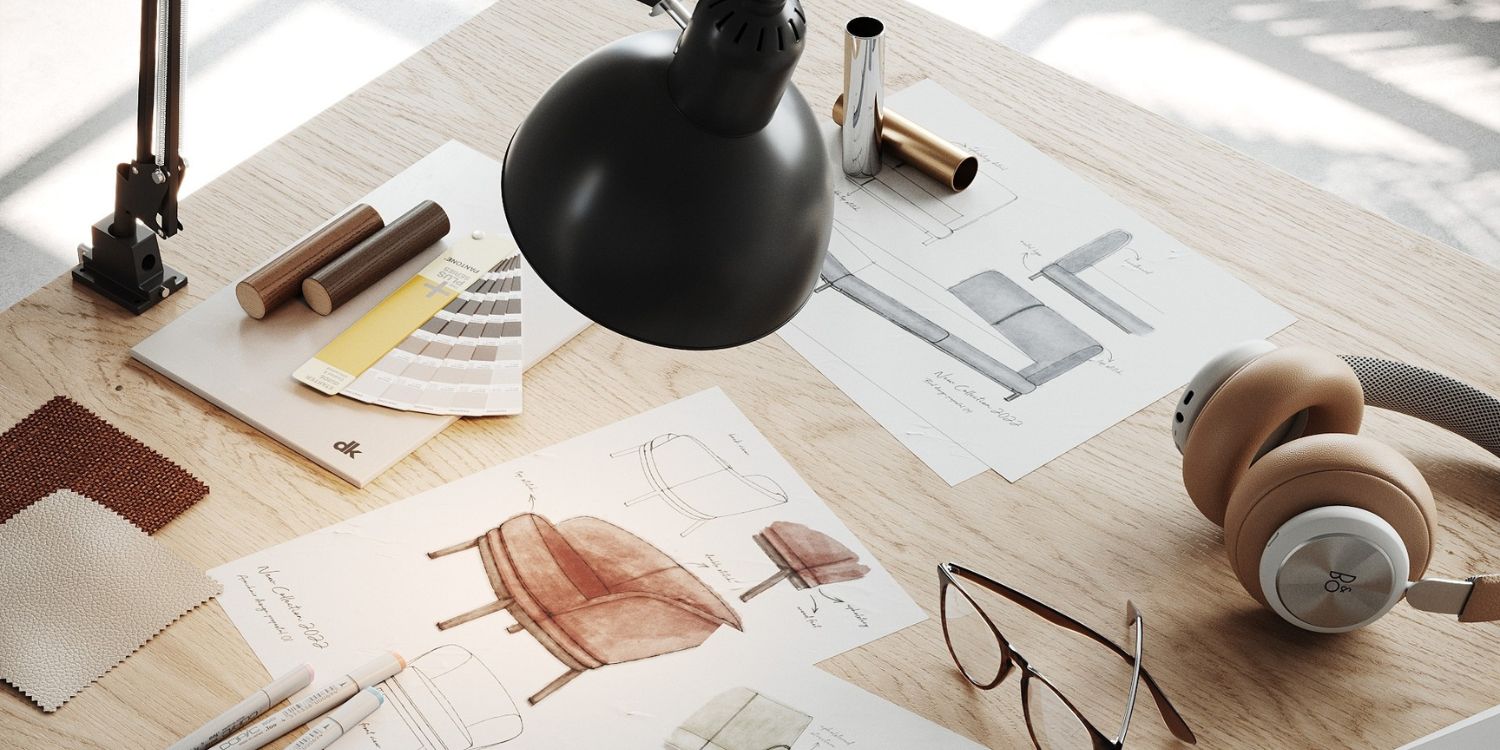
Few tools influence the visual language of interiors as consistently as Pantone. Year after year, the Pantone Color of the Year acts as both a cultural thermometer and a creative catalyst, capturing global moods, social shifts and emerging aesthetics in a single hue (or pairing). For interior design professionals, these colours are more than trend headlines; they are strategic signals that help guide palettes, materials, finishes and emotional narratives within spaces.
From the reassuring calm of Classic Blue in 2020 to the ethereal softness of Cloud Dancer for 2026, Pantone’s chromatic journey over the past years reads almost like a design diary of our collective mindset. Each colour responds to its moment in time: crisis, recovery, optimism, experimentation, grounding, and now, lightness.
Revisiting Pantone colours through the years allows designers to understand not just what was chosen, but why. And that understanding is what turns trend awareness into meaningful, long-lasting design decisions.
2020 | PANTONE 19-4052 Classic Blue
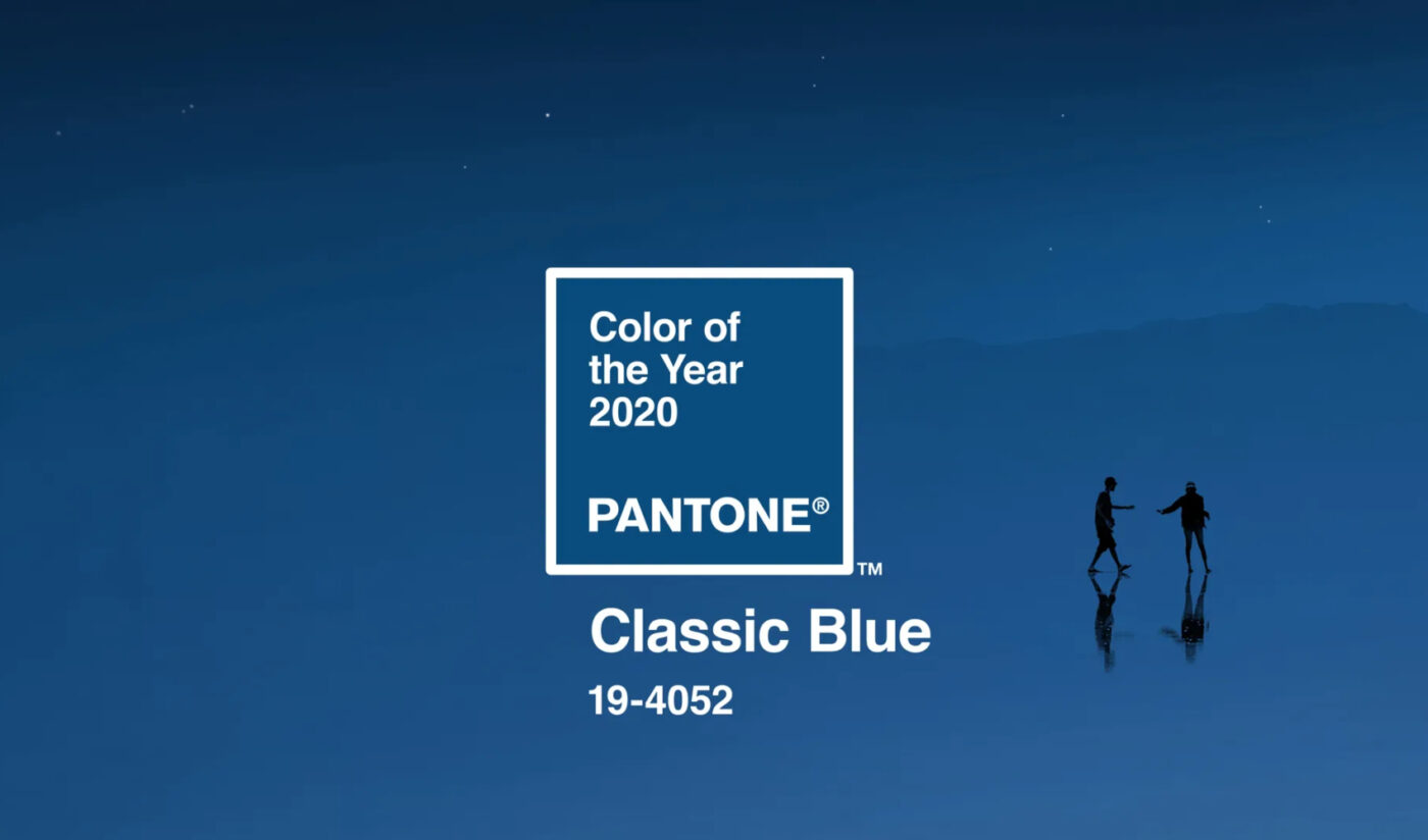
Stability, trust and quiet confidence
A timeless and enduring blue, PANTONE 19-4052 Classic Blue entered the global design conversation with a sense of calm authority. Elegant in its simplicity, it evokes the sky at dusk – that in-between moment where day gives way to night and everything feels momentarily still. At the threshold of a new era, Classic Blue reflected a collective desire for a dependable foundation on which to build.
Deeply imprinted in our psyches as a restful colour, Classic Blue brings an immediate sense of peace and tranquillity. It offers refuge rather than stimulation, making it especially powerful in environments where focus, balance and emotional grounding are essential. This is a colour that aids concentration and sharpens clarity, re-centring the mind in a world increasingly saturated with information and visual noise.
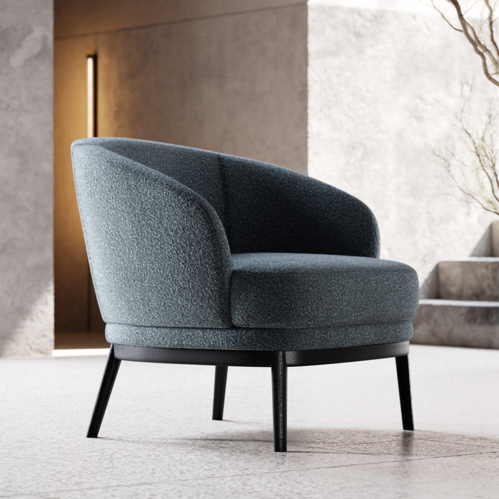
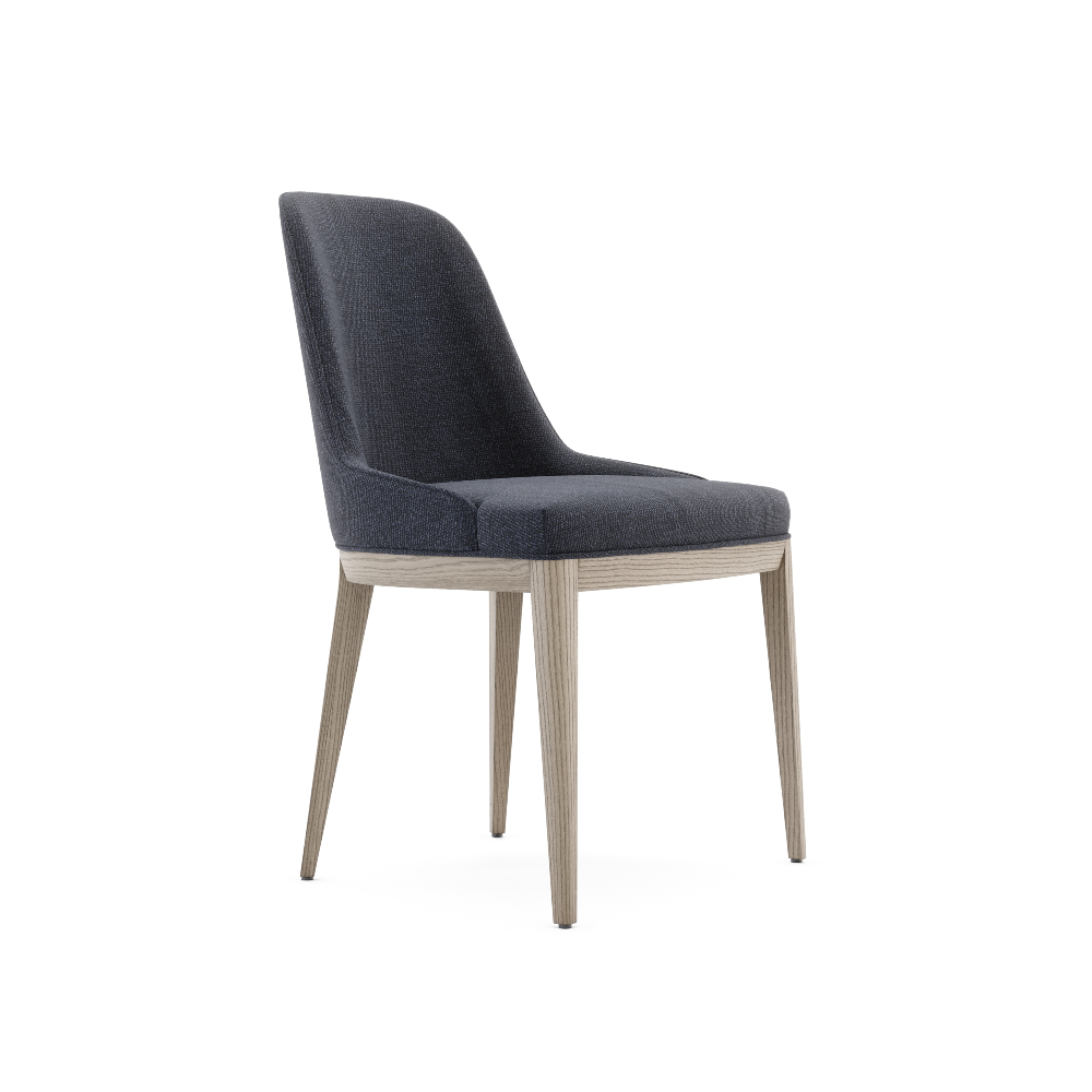
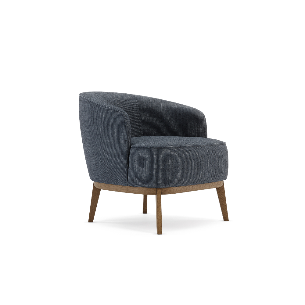
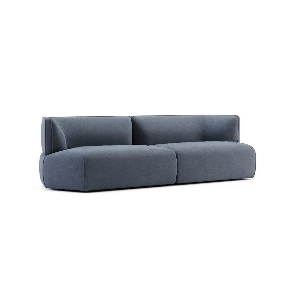
In interior design, Classic Blue quickly proved itself a pervasive favourite for the home. Its strength lies in versatility: it can act as a grounding base or as a confident statement, depending on scale and context. Upholstered sofas and armchairs in Classic Blue introduce depth without heaviness, while accent walls create atmosphere without overwhelming a space. It pairs effortlessly with brass and bronze details, walnut and oak woods, marble and warm neutral palettes.
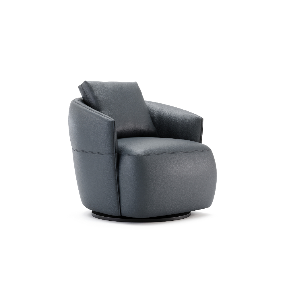
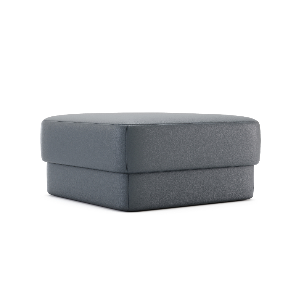
What makes Classic Blue truly enduring is its adaptability across materials and finishes. In velvet, it feels luxurious and enveloping; in leather, refined and timeless; in matte lacquers or textiles, calm and contemporary. It expresses tradition and elegance just as convincingly as it supports unexpected boldness.
2021 | PANTONE 17-5104 Ultimate Gray & PANTONE 13-0647 Illuminating

Resilience and optimism
For 2021, Pantone selected two independent yet complementary colours to reflect a defining global mood. PANTONE 17-5104 Ultimate Gray and PANTONE 13-0647 Illuminating express a balance between strength and hope: practical, reassuring and quietly optimistic.
Ultimate Gray evokes the enduring tones of stone and natural elements shaped by time. Solid and dependable, it represents stability and resilience, offering a grounding presence that encourages composure and clarity. Illuminating, on the other hand, introduces warmth and vitality. This bright, solar yellow radiates energy, optimism and emotional uplift, responding to a universal need for light and reassurance.
Together, these colours tell a human story: optimism is strongest when supported by a stable foundation. The pairing offered comfort without complacency and hope without excess, reminding us that brighter days are built on resilience.
In interior design, this dual palette proved highly versatile. Ultimate Gray naturally anchored spaces through walls, flooring and larger furniture pieces, while Illuminating brought moments of energy through accents, textiles and statement details. In both residential and professional environments, the combination fostered balanced, uplifting interiors – spaces that felt steady, welcoming and forward-looking.
2022 | PANTONE 17-3938 Very Peri
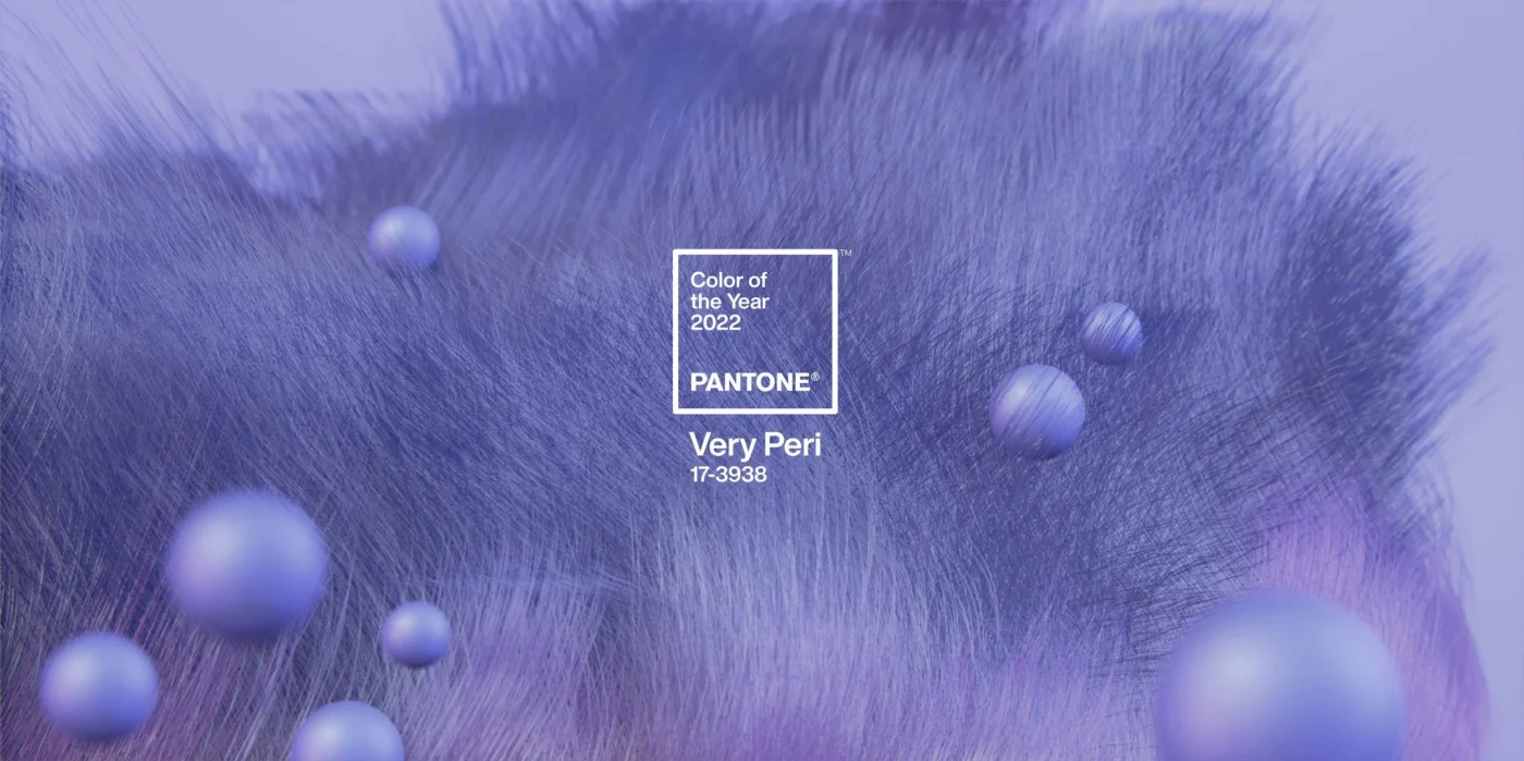
Transformation, creativity and a new visual language
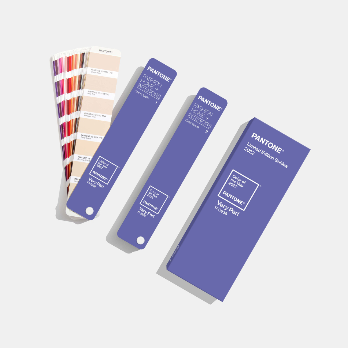
With PANTONE 17-3938 Very Peri, Pantone captured the spirit of a world in transition. This inquisitive blue-violet shade reflects carefree confidence and a daring curiosity, encouraging us to embrace new possibilities as the boundaries between physical and digital life continue to blur. As Pantone’s first custom-created colour, Very Peri itself became a symbol of reinvention.
Rooted in the reassuring qualities of blue, Very Peri introduces a fresh perspective through its violet undertone, placing the future in a new light. It speaks to stability reimagined, balancing familiarity with experimentation and forward-thinking creativity.
Emerging alongside the rise of digital design, gaming culture and the expanding metaverse, Very Peri illustrates how colour trends now move fluidly between virtual and physical worlds. This fusion reshaped how designers approached creativity, encouraging more expressive and unconventional choices.
In interiors, Very Peri injected playful modernity. Used on feature walls, ceilings, statement furniture or as an accent in patterns and décor, it enlivened spaces through unexpected combinations. Versatile across materials and finishes, it became a catalyst for bold expression, reminding designers that transformation is not only inevitable but creatively empowering.
2023 | PANTONE 18-1750 Viva Magenta
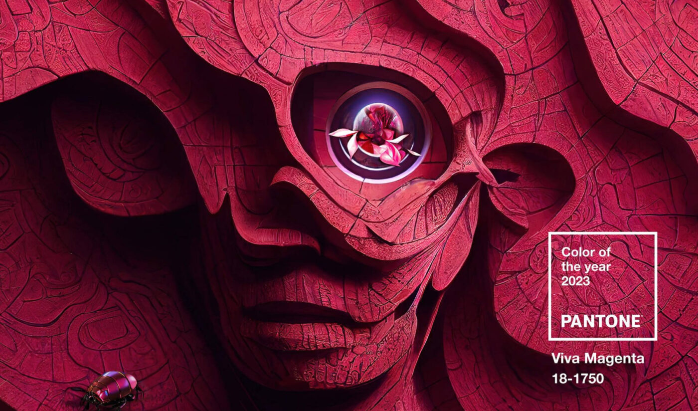
Bold expression and vitality
With PANTONE 18-1750 Viva Magenta, Pantone introduced a colour that pulses with confidence and life. Rooted in the red family yet unmistakably contemporary, this vibrant shade signals strength, joy and emotional intensity. Viva Magenta emerged as a celebration of fearless creativity – encouraging self-expression without restraint and inviting designers to embrace colour as a powerful narrative tool.
Audacious yet inclusive, Viva Magenta strikes a balance between rebellious energy and warmth. It is expressive without being aggressive, making it a compelling choice for interiors that aim to feel alive, optimistic and personal. More than a visual statement, it reflects a desire for boldness grounded in human connection.
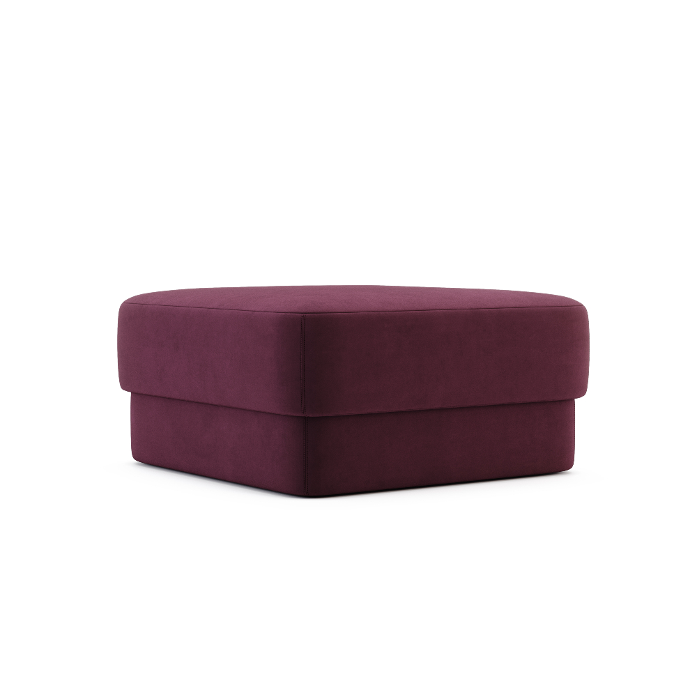
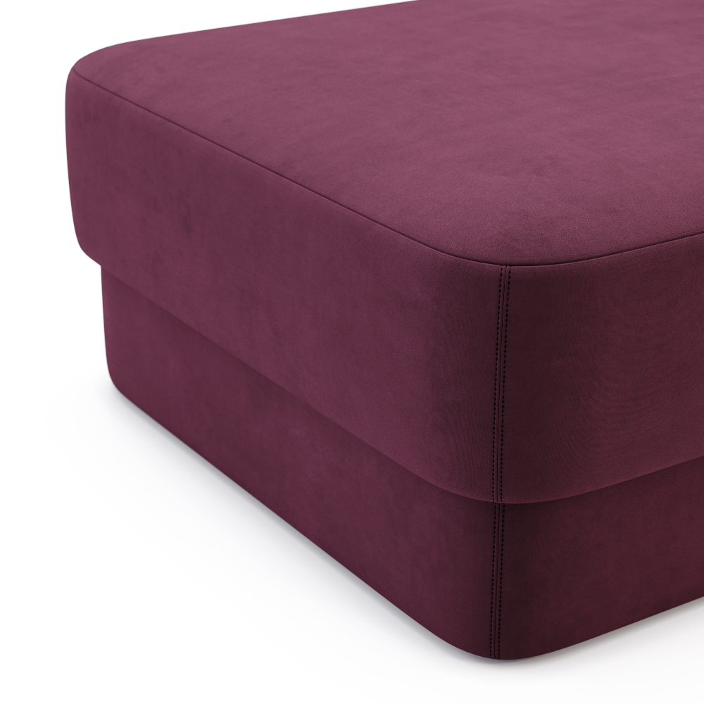
In interior design, Viva Magenta works best when applied with intention. As a statement – through velvet upholstery, sculptural seating or a lacquered feature wall – it delivers drama and depth. Used more sparingly, it acts as a striking accent in textiles, artwork or lighting, energising neutral spaces without overwhelming them.
2024 | PANTONE 13-1023 Peach Fuzz

Comfort, warmth and nurturing energy
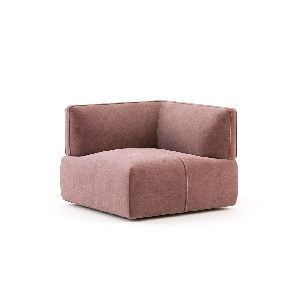
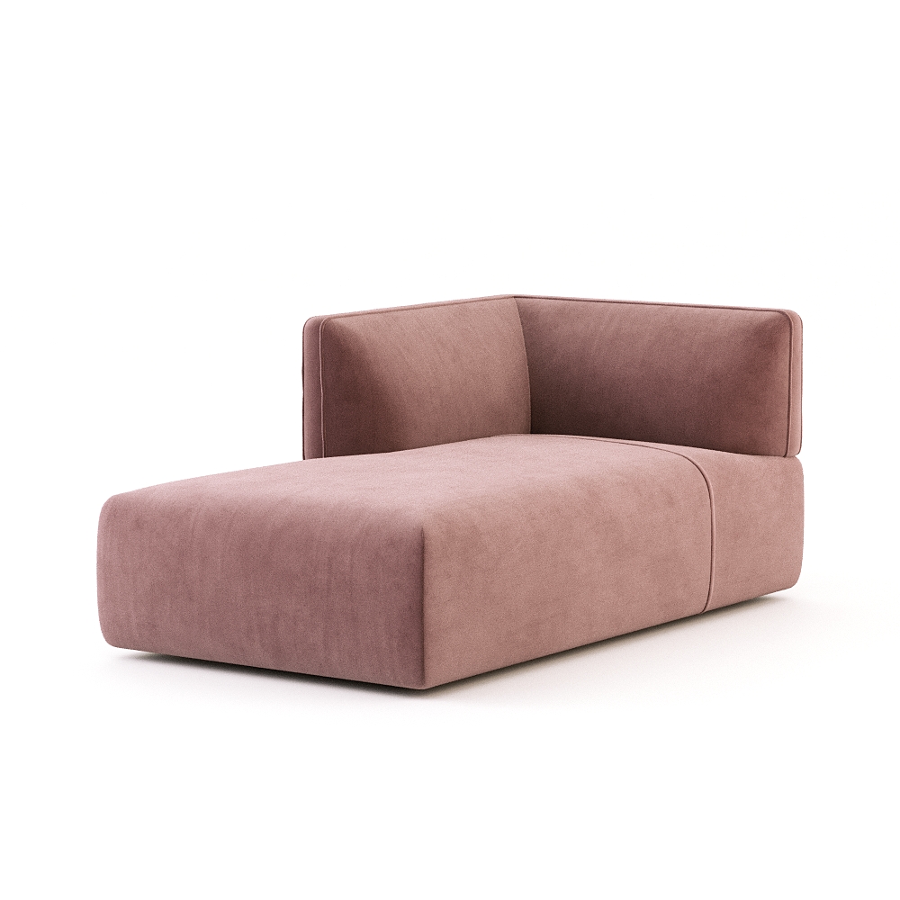
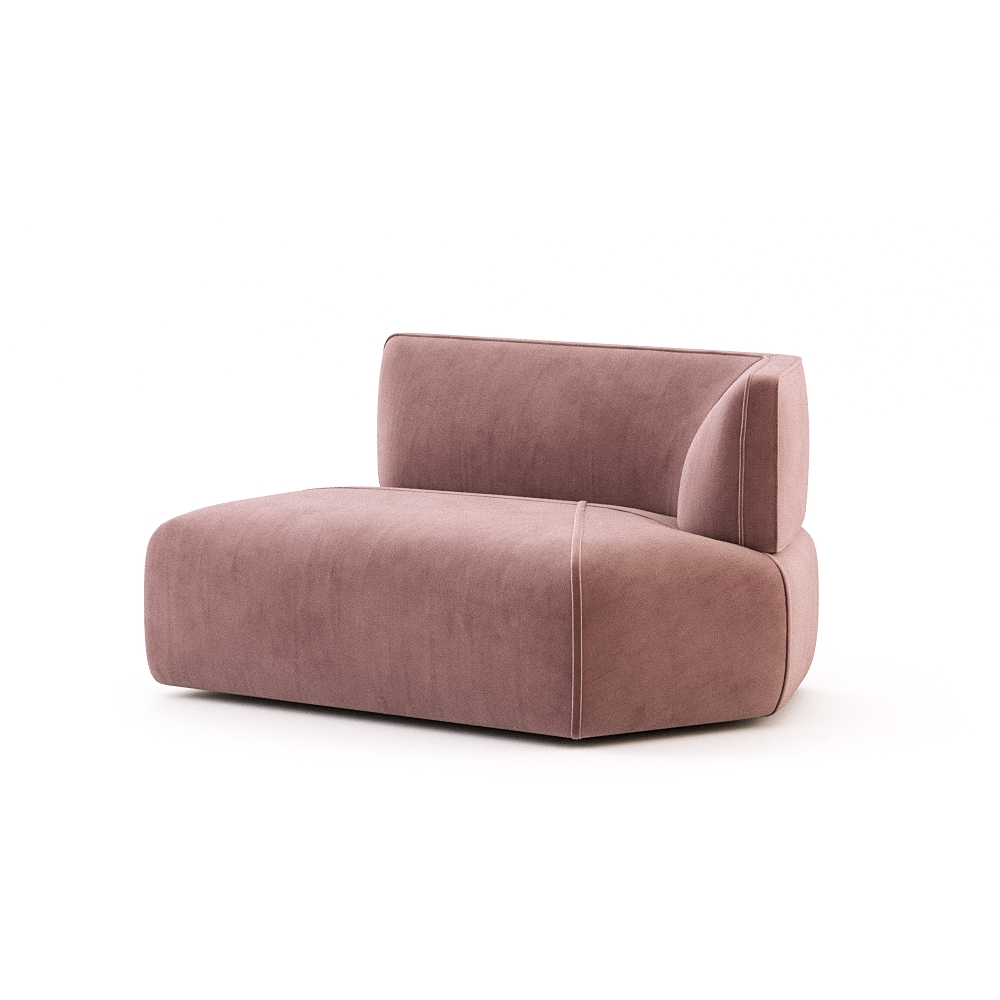
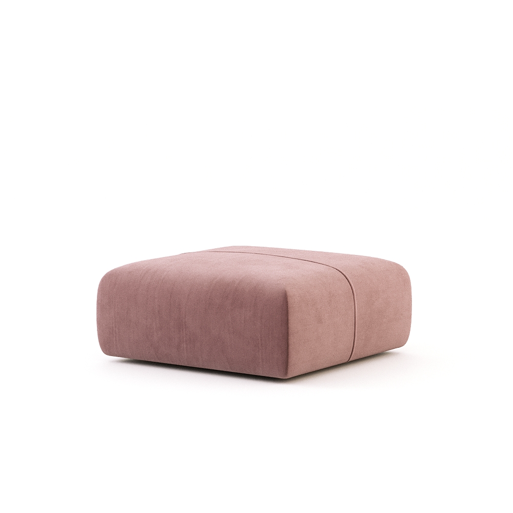
PANTONE 13-1023 Peach Fuzz embodies gentleness and care. A soft, velvety peach tone, it evokes nurturing qualities that soothe the mind, body and soul. Peach Fuzz reflects our growing desire to create spaces that are not only visually appealing but also emotionally supportive – a colour that encourages well-being and connection in every corner of the home.
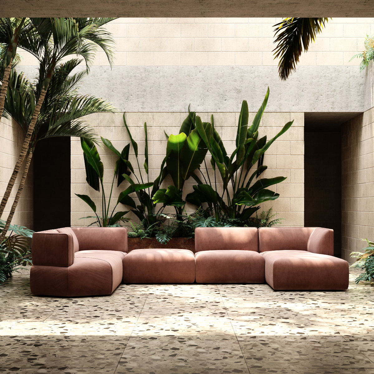
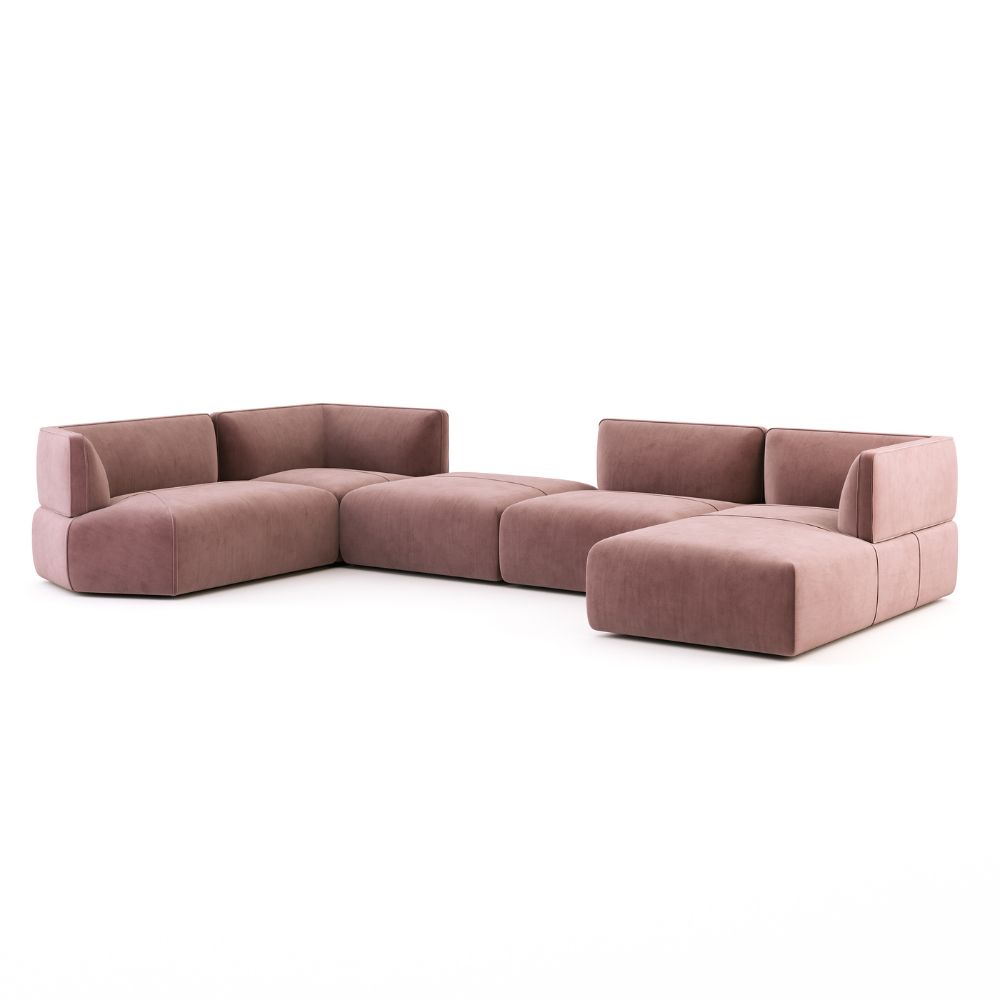
In interiors, Peach Fuzz brings warmth and approachability. Its subtle vibrancy works beautifully on painted walls, adding a cosy backdrop without overwhelming a space. As an accent, it enriches textiles, patterns and home décor, creating layers of softness that feel tactile and inviting. Furniture upholstered in Peach Fuzz encourages lingering and conversation, while textiles like cushions or throws add intimate touches that make a space feel deeply personal.
The colour pairs effortlessly with creams, warm neutrals and light wood finishes, complementing natural textures and aligning with biophilic design principles. It also integrates well with other soft tones, offering endless opportunities for layering, tonal exploration and seasonal versatility.
2025 | PANTONE 17-1230 Mocha Mousse
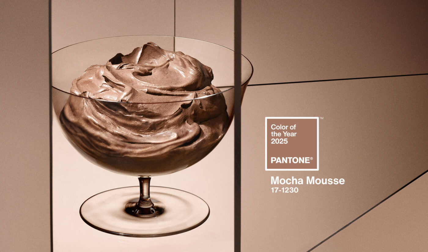
Grounding warmth and comforting richness
For 2025, the Pantone Color Institute selected PANTONE 17-1230 Mocha Mousse, a warming brown hue infused with depth and sophistication. Evoking the rich, indulgent qualities of chocolate and coffee, Mocha Mousse speaks directly to our desire for comfort, familiarity and understated elegance. It’s a colour that feels simultaneously cosy and refined – a subtle statement of grounded luxury.
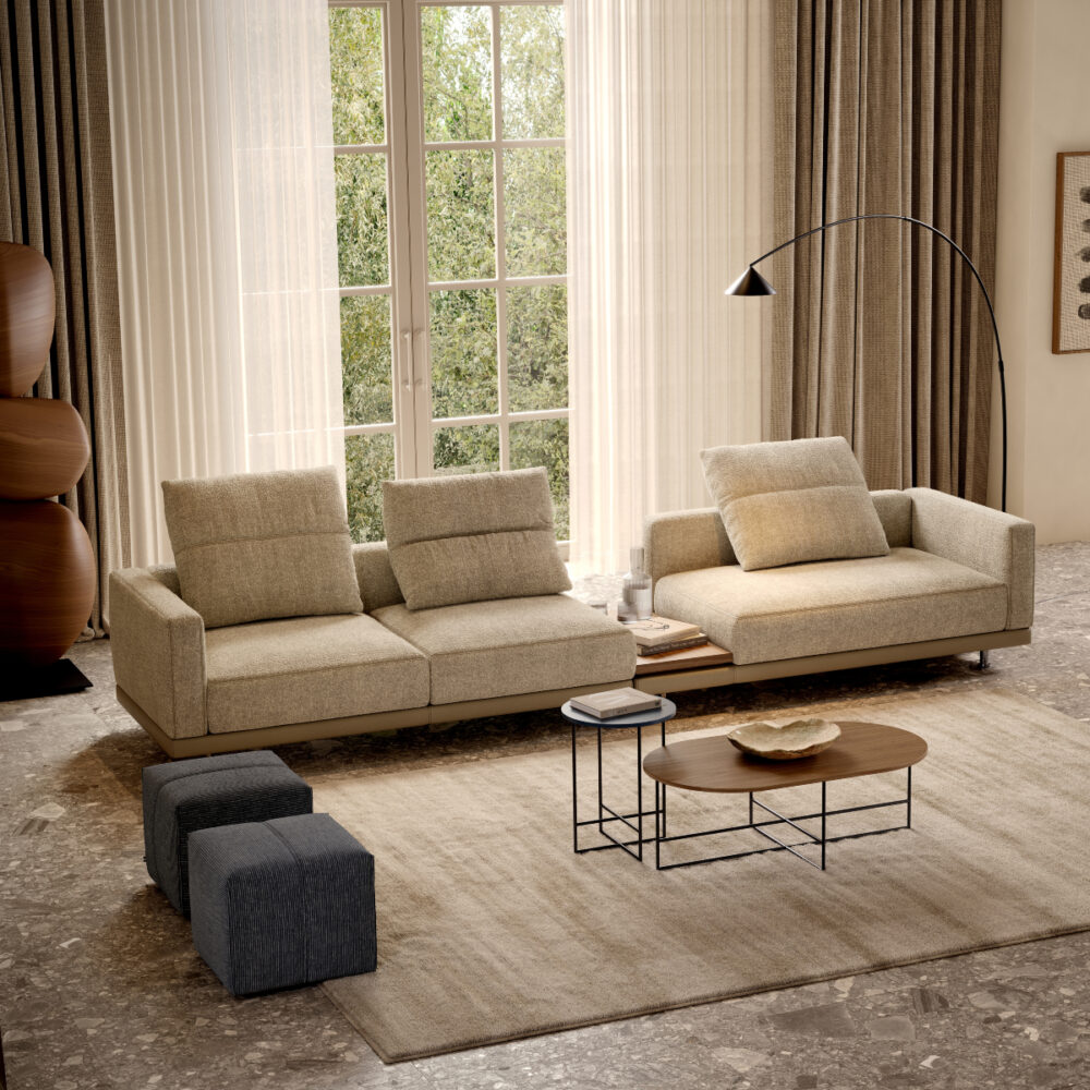
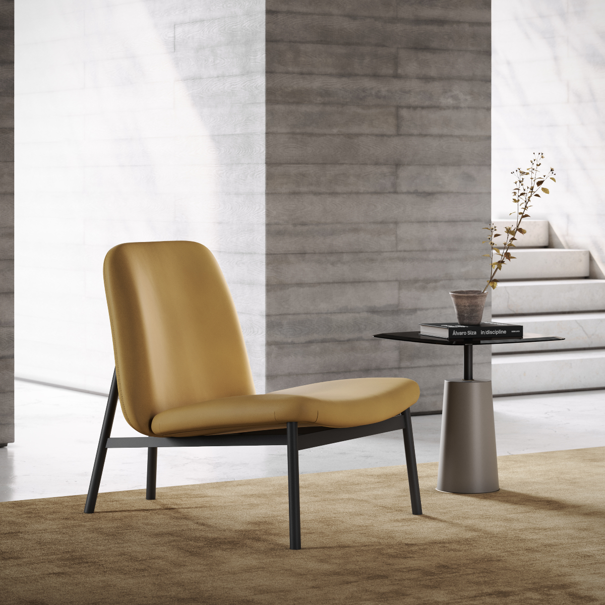
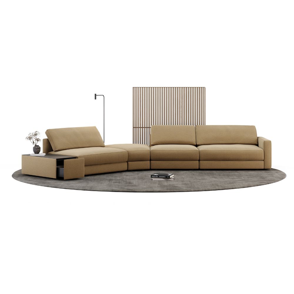
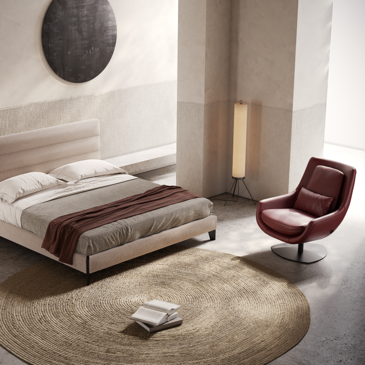
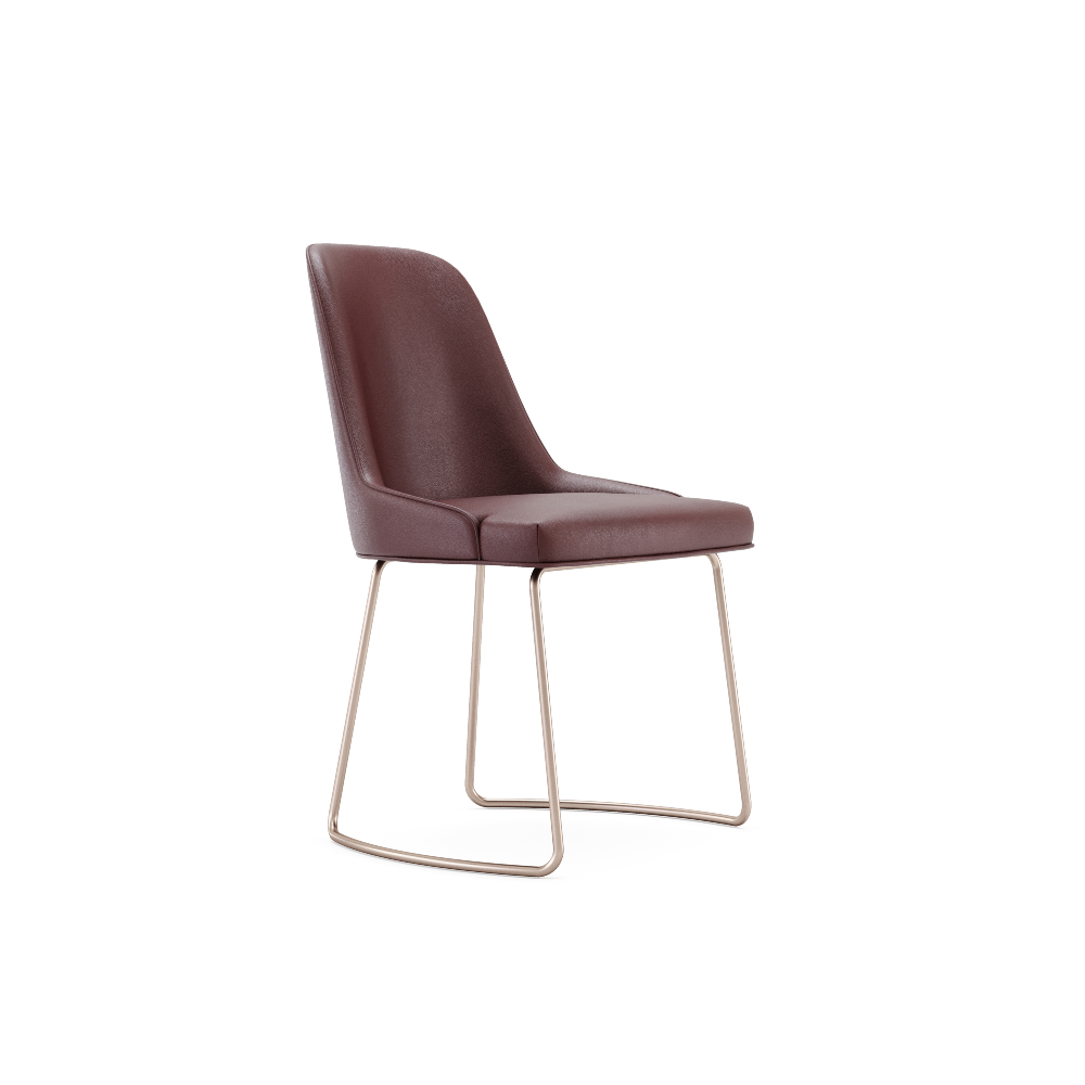
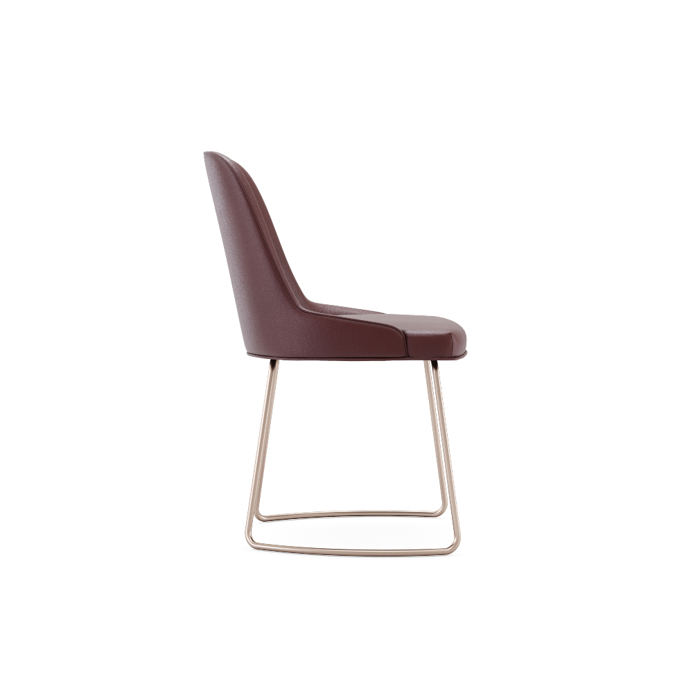
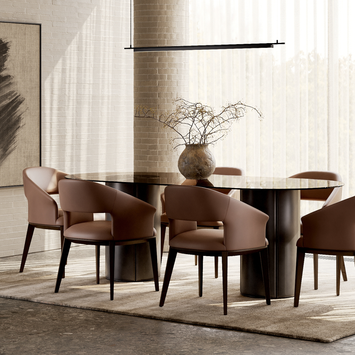
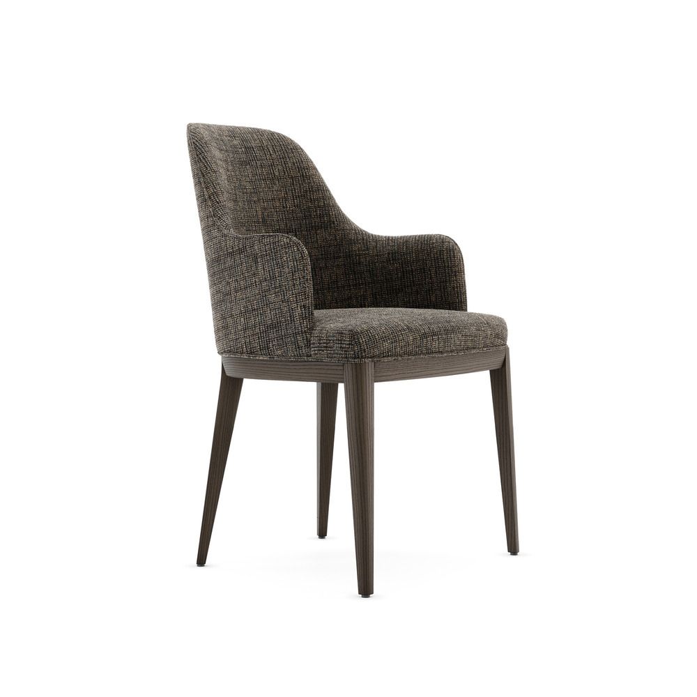
In interiors, Mocha Mousse provides a stable, versatile foundation. It works beautifully as a base tone for sofas, dining chairs, cabinetry and other key furniture pieces, offering an alternative to more conventional dark neutrals like black or charcoal. Its natural warmth pairs effortlessly with leather, stone, bronze and textured fabrics, enhancing a space’s tactile and visual depth.
The colour also brings flexibility in layering palettes. It harmonises with soft neutrals for a serene, minimalist aesthetic while acting as a counterpoint to vibrant accent hues for more dynamic compositions.
Ultimately, PANTONE 17-1230 Mocha Mousse embodies a philosophy of design that prioritises comfort, longevity and sophistication. It is a colour that nurtures, reassures and inspires confidence – perfect for interiors that balance functionality with a subtle, enduring elegance.
2026 | PANTONE 11-4201 Cloud Dancer
Serenity, lightness and mindful design
Introducing PANTONE 11-4201 Cloud Dancer, Pantone’s Color of the Year 2026, a soft, luminous white that embodies calm, clarity and thoughtful restraint. Cloud Dancer reflects a collective desire for quiet reflection, offering a visual pause in a world that is increasingly fast-paced and cluttered. Its serene presence encourages relaxation, focus and creativity, allowing mind and space to breathe.
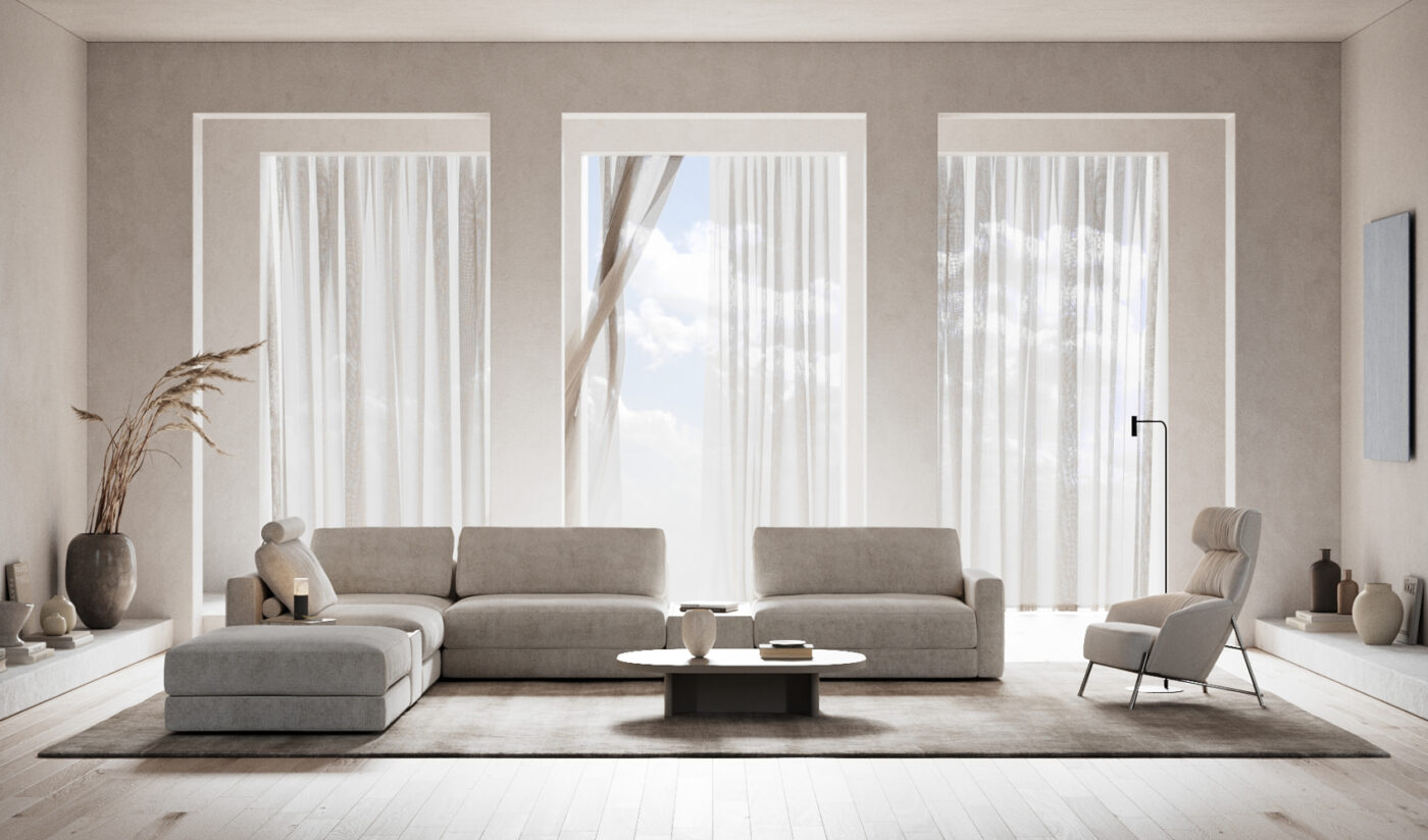
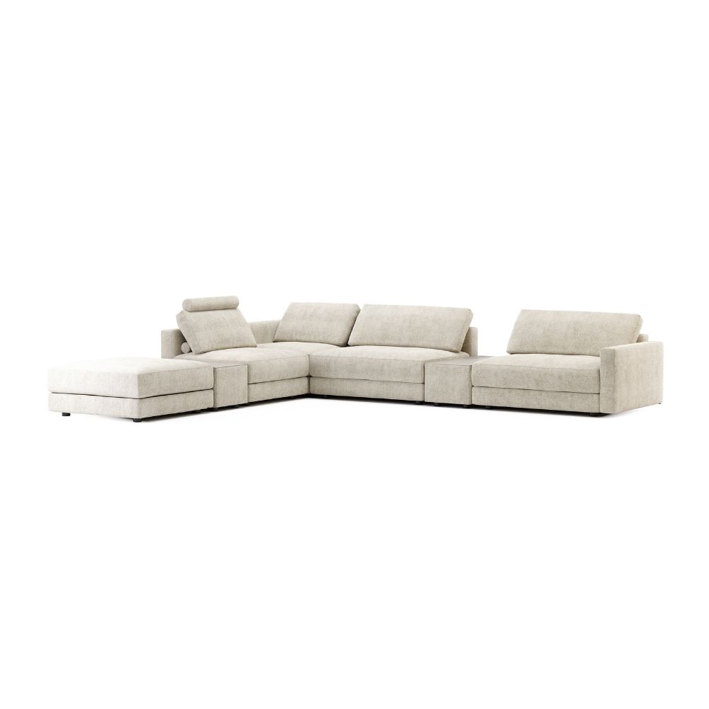
In interiors, Cloud Dancer acts as a versatile foundation. Its expansive, airy quality enhances natural light and opens up spaces, creating environments that feel spacious, clean and restorative. It works beautifully across residential and commercial projects – from tranquil bathrooms that evoke a spa-like serenity to kitchens and living areas where openness and flow are paramount.
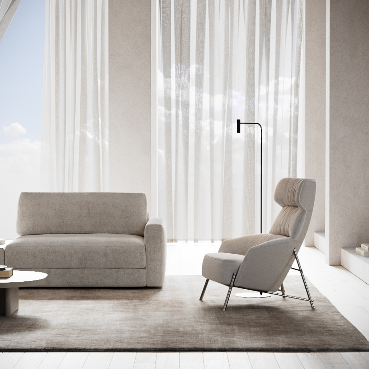
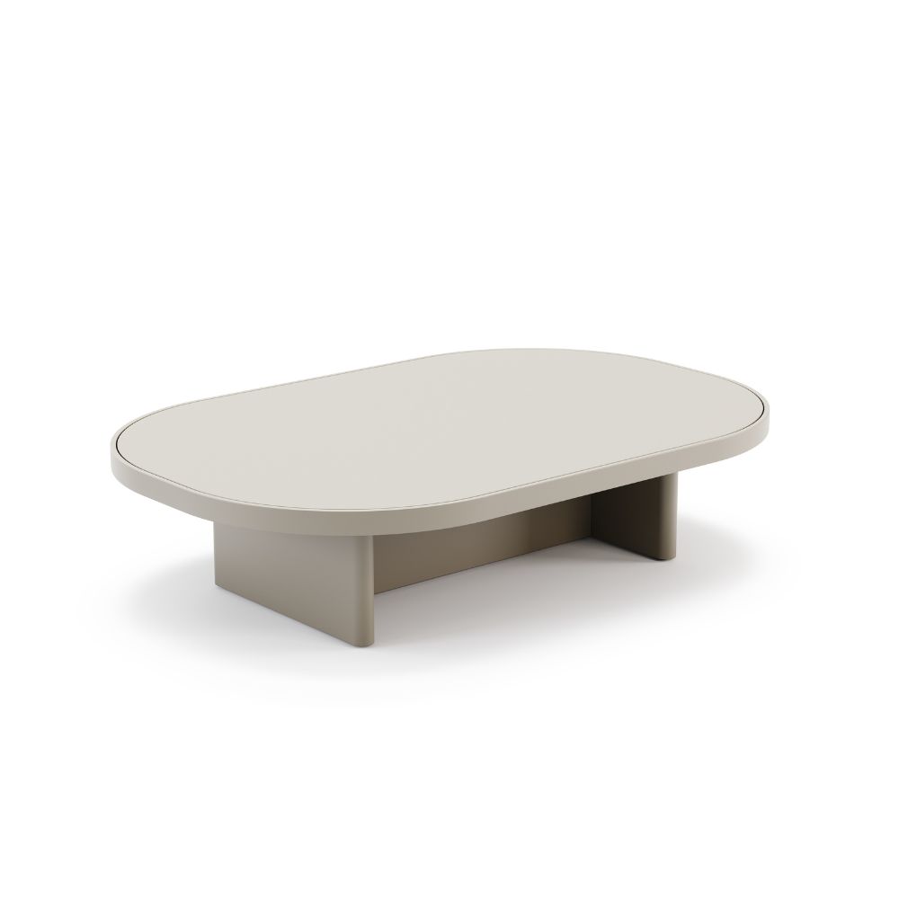
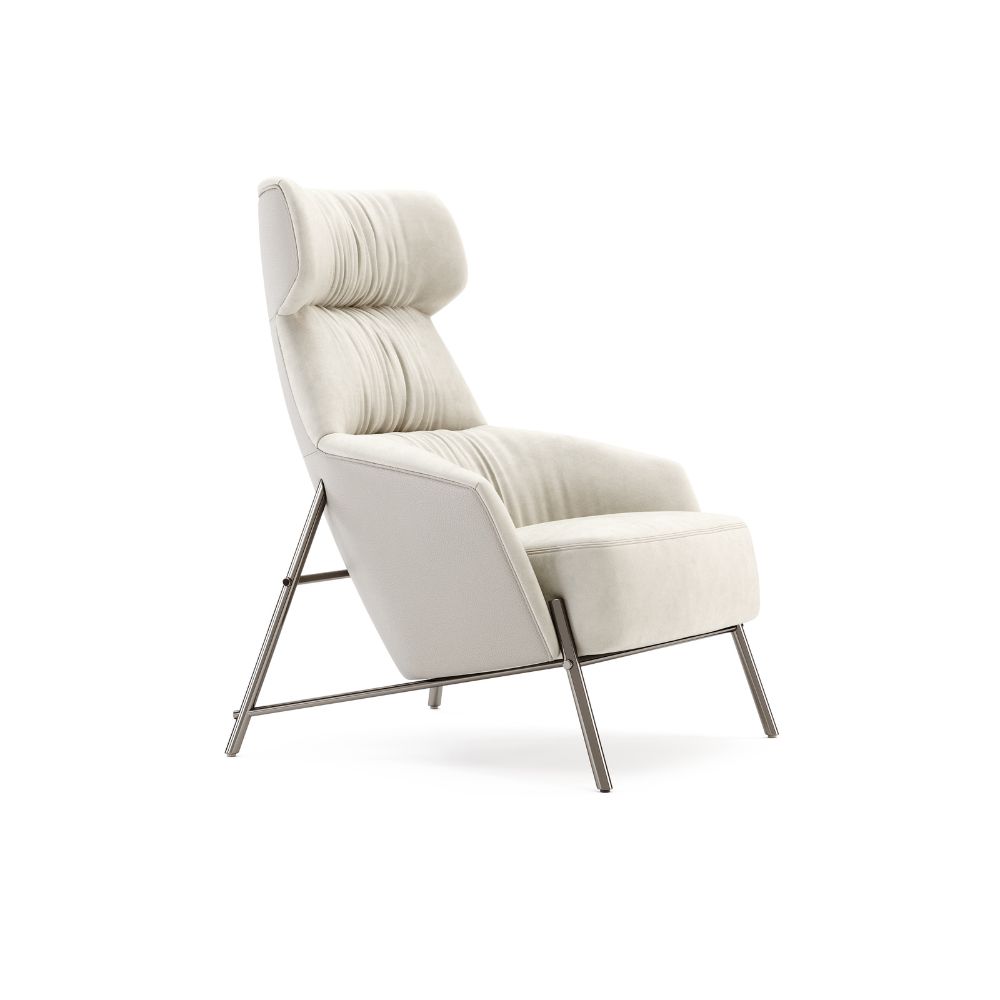
This colour also supports a layered design. Cloud Dancer provides a neutral canvas for textures, materials and accent hues to shine, allowing designers to introduce depth, warmth or playful colour contrasts without losing a sense of calm. Furniture, upholstery and decorative elements in Cloud Dancer create cohesion and balance, helping to establish spaces that are simultaneously minimal and inviting.
Beyond its aesthetic versatility, Cloud Dancer carries a philosophical resonance. It signals a conscious choice to simplify, declutter and design with intention. It proves that minimalism doesn’t have to feel cold or impersonal; softness and lightness themselves can be powerful statements of sophistication, comfort and well-being.
Understanding Pantone colours through the years equips interior design professionals with more than trend knowledge; it offers cultural and emotional context. This insight leads to stronger concepts, more confident colour choices and interiors that resonate beyond the moment.
When used strategically, Pantone becomes a design tool rather than a directive, helping you create spaces that feel relevant, intentional and enduring!
YOU MAY ALSO LIKE: Pantone Color Of The Year 2026: 5 Reasons To Use The Cloud Dancer
We are working every day to bring you the most stylish ideas to fulfil your inspiration and to create the best interior design projects, so feel free to follow our Instagram Page and subscribe to our newsletter.

