The “Less Is More” look, best known as minimalism, is one of the few trends that has the most impact on the interior design industry. Recently, we wrote an article about cosy minimalism, which is one of the strands of this style, so it is clearly one of our guiding principles!
Minimalism has impacted consumer habits, tastes and even how we can create a design that is better for the environment. But what does this movement really mean? The easiest way to explain it is with the architect Ludwig Mies van der Rohe’s phrase “Less Is More” – this means that function is prioritised over form, sticking to only the essential. This style is characterized by the use of few colours, simple lines and a pragmatic approach to ornament selection.
Now that minimalist is explained, let’s go through the most important factors so you can achieve the “Less Is More” look in your interior design project!
01. Keep only the essential elements to your design
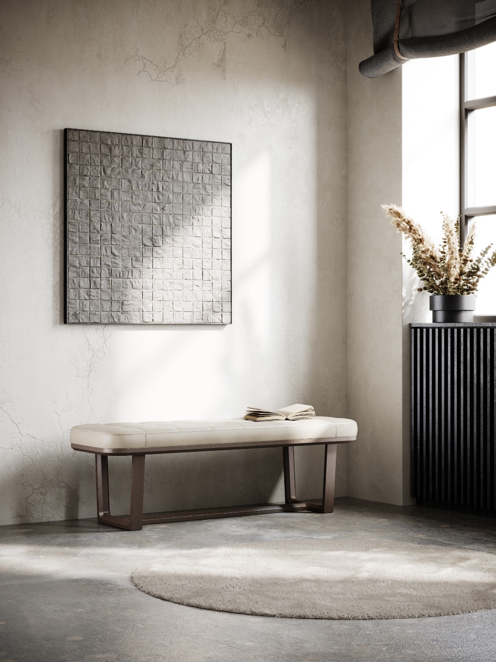
To get the “Less Is More” look it is important to adapt your own style to the minimalist principles. Let the lines of the architecture stand out and keep the furniture simple and functional, without unnecessary ornaments.
If you are thinking of adding more pieces to fill the space you are designing – don’t. The more open and clear the room is, the better it will look!
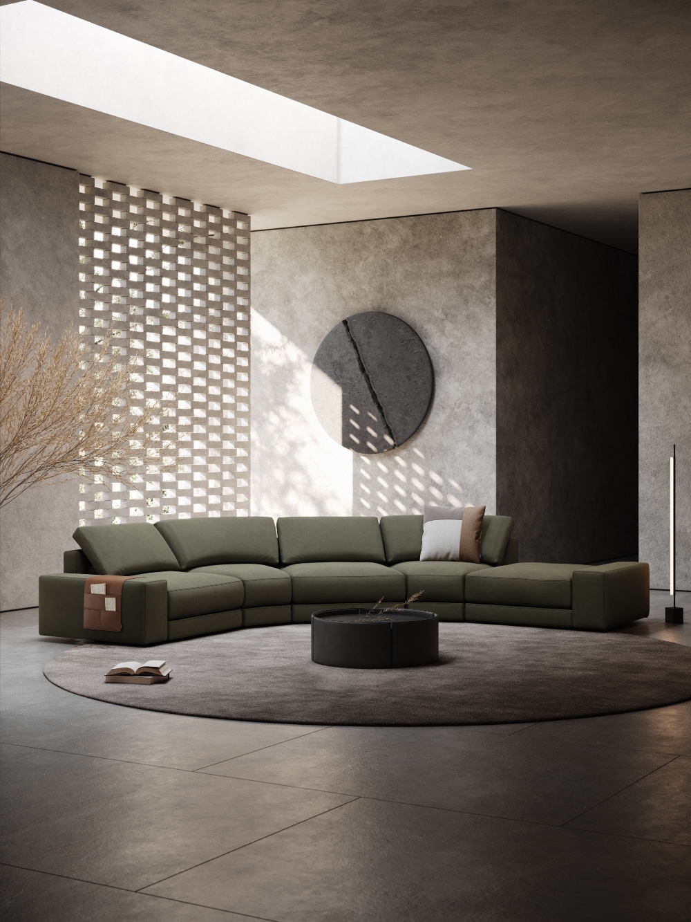
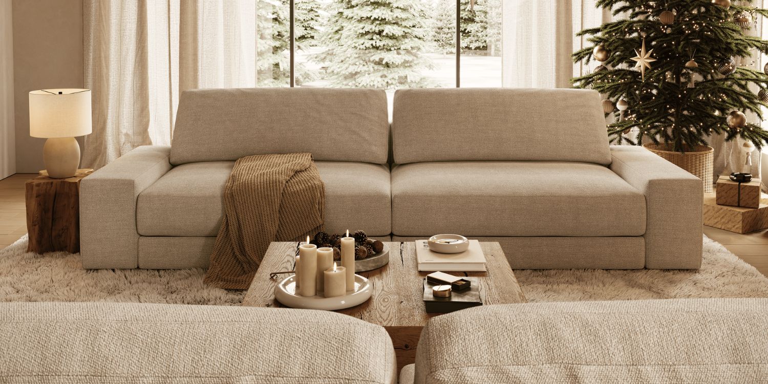
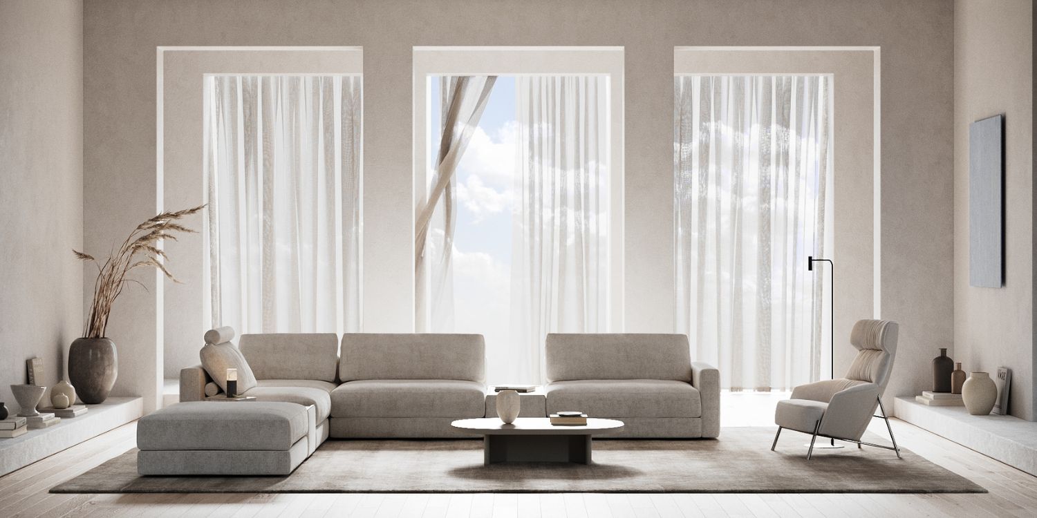
For example, suppose you are designing a living room. In that case, we suggest a modular sofa like our Edward Sofa – it has a minimalistic design with generous proportions. It has a distinct character for its versatility, especially when combined with different accessories, such as a magazine rack, a headrest and a side table. Pair it with a coffee table like our Mano and your project is complete!
02. Opt for a warm colour palette
A minimalist project can transmit a feeling of coldness because it is necessary to remove all the ornaments and bold colours of the space.
However, there is a solution for that: a warm colour palette. By using warm colours in a project, a paint that interacts well with the architecture, lighting and sun orientation, you will be able to achieve the “Less Is More” look without the risk of being too impersonal.
Also, wooden and timber floors are a great choice because you can get a natural look back on your style and design!
03. Add a personal touch
Minimalism does not have to mean total bareness! The person you are designing your project for still requires their needs met and their comfort levels satisfied. Adapt the minimalist rules to your client, have their needs and tastes in mind, and what they like to do in the space you are designing.
If your client loves to read, add a bookshelf; if a specific colour makes them feel happier, add a touch of that colour to the space; if they want a dining room without too many distractions, focus only on the furniture pieces!
Adding a chair like our Vianna to a dining room, for example, will add a classic touch with a modern twist to your project! Supported by four wooden legs, the padded seat and back cushion create the perfect accessory for both domestic and public settings. Available in two versions, with or without armrests, the top of the backrest arc outwards for maximum relaxation. Along its extremities, sophisticated piping adds a timeless touch to the design.
04. Prioritise storage space
When it comes to minimalism, it will only look good when clutter is kept to the bare minimum. When designing a minimalist project, you won’t want to see disorganization and elements out of space, it will stand out incorrectly.
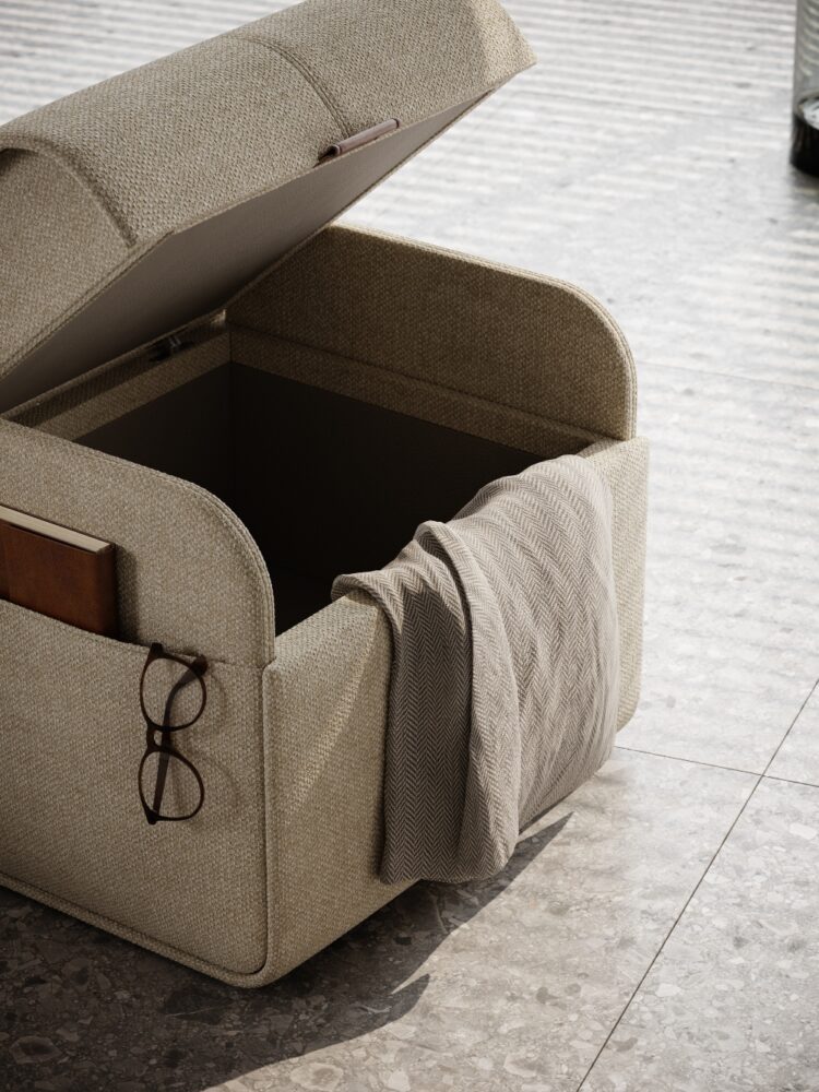
Prioritise storage space in every room and ensure the furniture you select has drawers, shelves or a discrete space for clutter like our pouffs with hidden storage. Our Adley Pouf serves as a storage piece or even as additional seating – it has an effortless opening system that takes over the contemporary field and gives it another impact, allowing storage suitable for every kind of living.
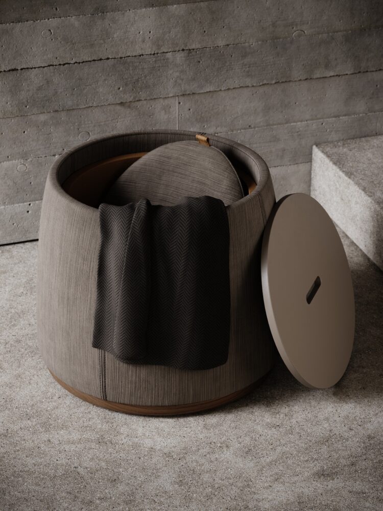
Our Avery Pouf can be even more functional! It has a solid lacquered top that can be found to be used as a side table along with storage space, blending functionality with a straightforward design. Which one do you prefer?
Finally, minimalists believe in spending thoughtfully on the smallest amount of things possible. While achieving the “Less Is More” look aesthetic, you can also invest in quality products that will last for decades – it will be good for the planet and it will add another meaning to the project!
Do you have any more tips on how to achieve the “Less Is More” look? Let us know in the comment section.
YOU MAY ALSO LIKE: Canada: The Best Interior Designers You Need To Know
We are working every day to bring you the most stylish ideas to fulfil your inspiration and to create the best interior design projects so feel free to follow our Instagram Page and subscribe to our newsletter.


