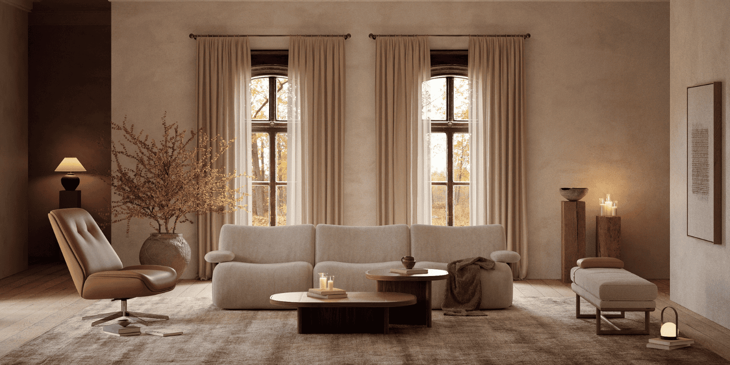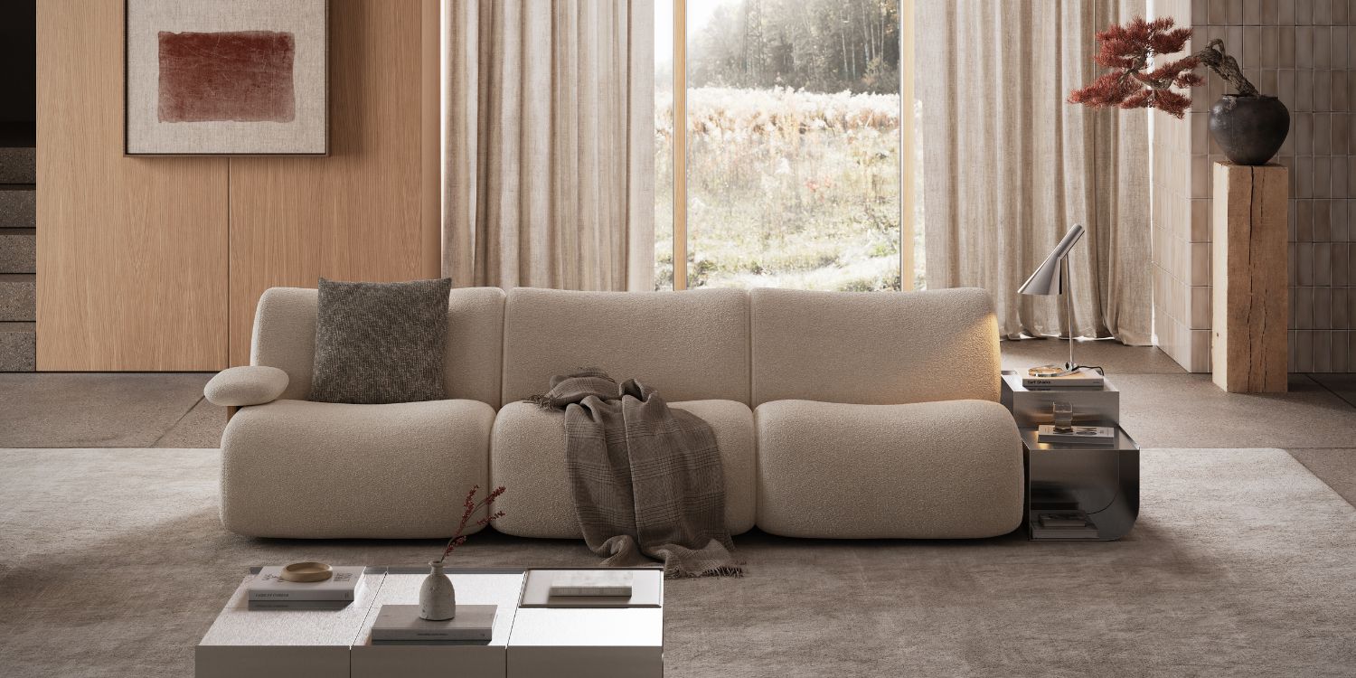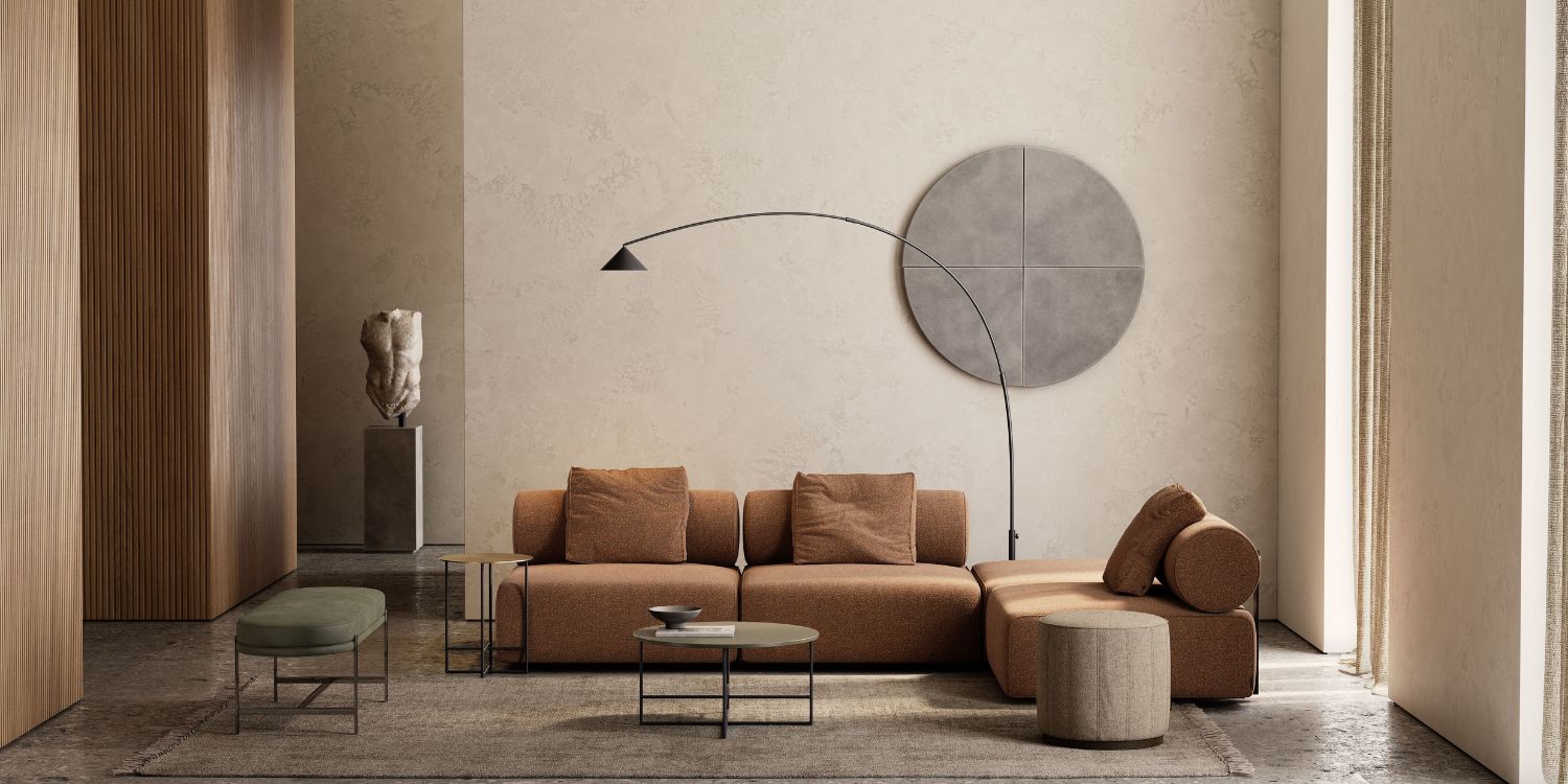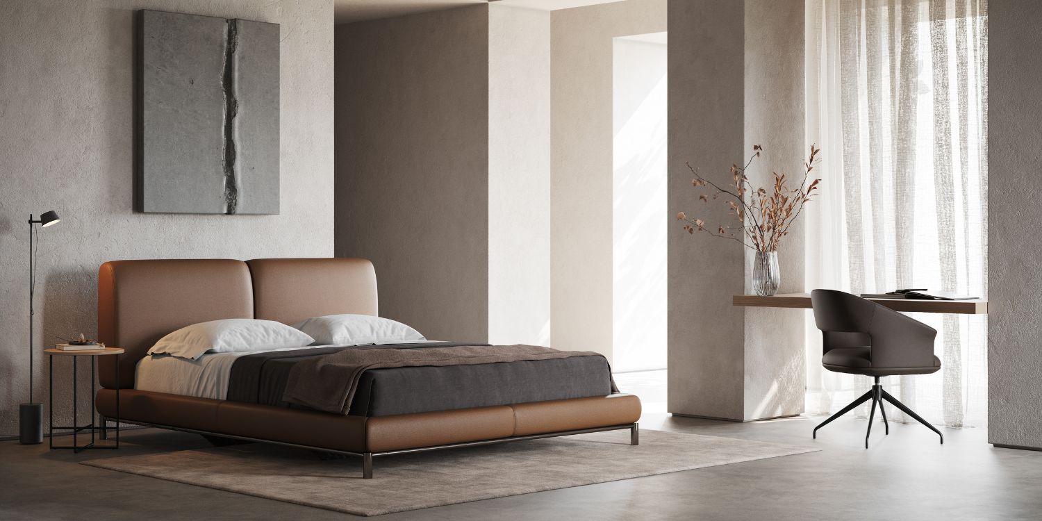


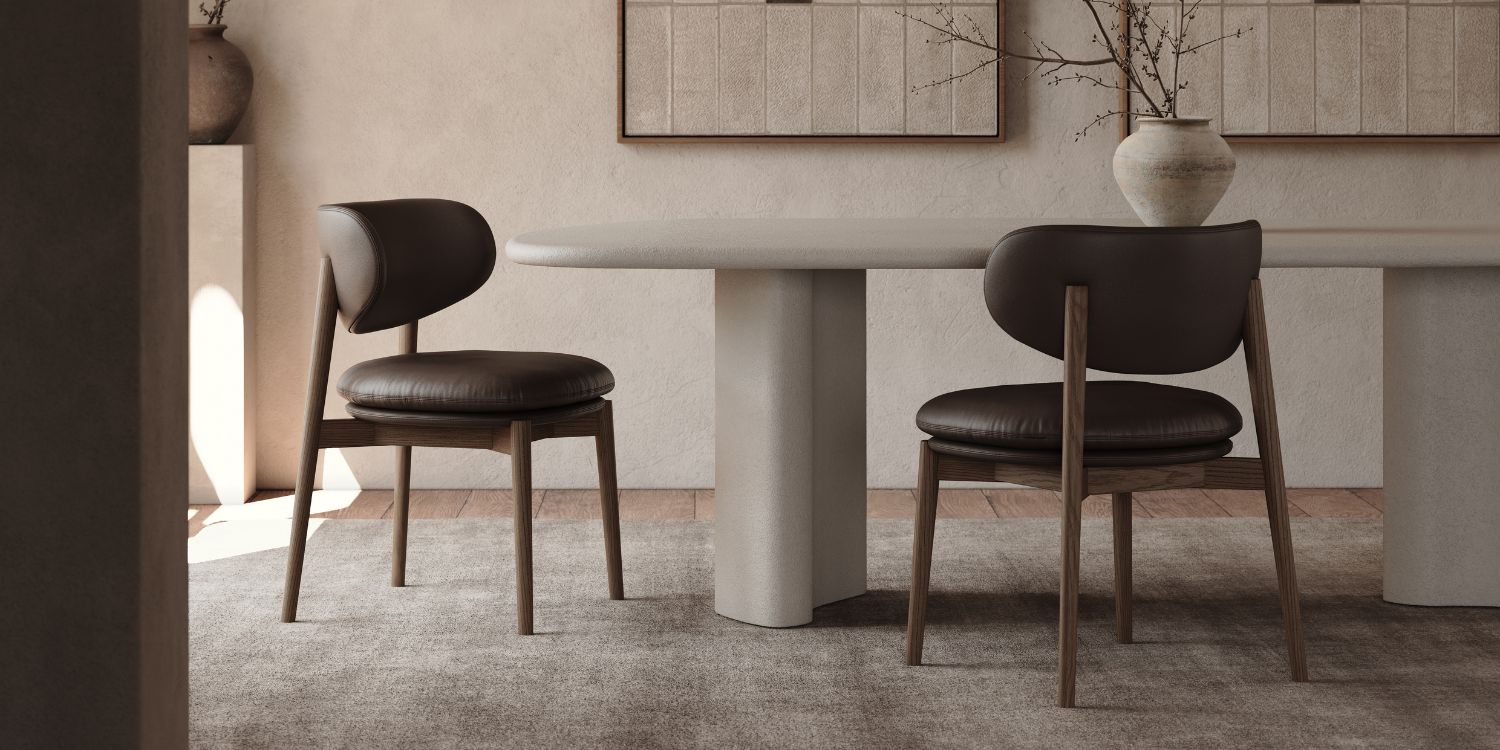
Walk into any design fair or scroll any moodboard this year and chocolate brown is there – on a bouclé sofa, a leather lounge chair or a headboard photographed in low, buttery light. Chocolate brown upholstery has become one of the defining colours of 2026 and the enthusiasm isn’t hard to understand. It reads as warm rather than heavy, grounded rather than dull and it sits beautifully against the travertine and brushed brass already common in residential and hospitality interiors.
Designers have seen this pattern before, though. A colour surfaces, saturates every platform within a season and quietly disappears from spec sheets a year or two later – often right around the time the project it was chosen for is finally being installed. The real question isn’t whether chocolate brown is beautiful. It’s whether it will still make sense in a space five or ten years from now.
This article looks at chocolate brown through that longer lens, offering a framework for making that call project by project, rather than a simple verdict.
Why Chocolate Brown Is Having a Moment
Chocolate brown’s rise isn’t really about brown at all – it’s the visible edge of several bigger movements converging at once.
Quiet luxury has trained the eye to associate restraint with quality and brown communicates expense without shouting about it. Earth-inspired palettes have been building for years, moving interiors away from anything synthetic or overly polished – brown belongs here the way olive and terracotta already do. Hospitality-inspired interiors have brought theatricality into residential specification and the moody, low-lit lounge atmosphere once reserved for boutique hotel bars now shows up in living rooms, carried by deep brown upholstery better than by almost any other neutral.
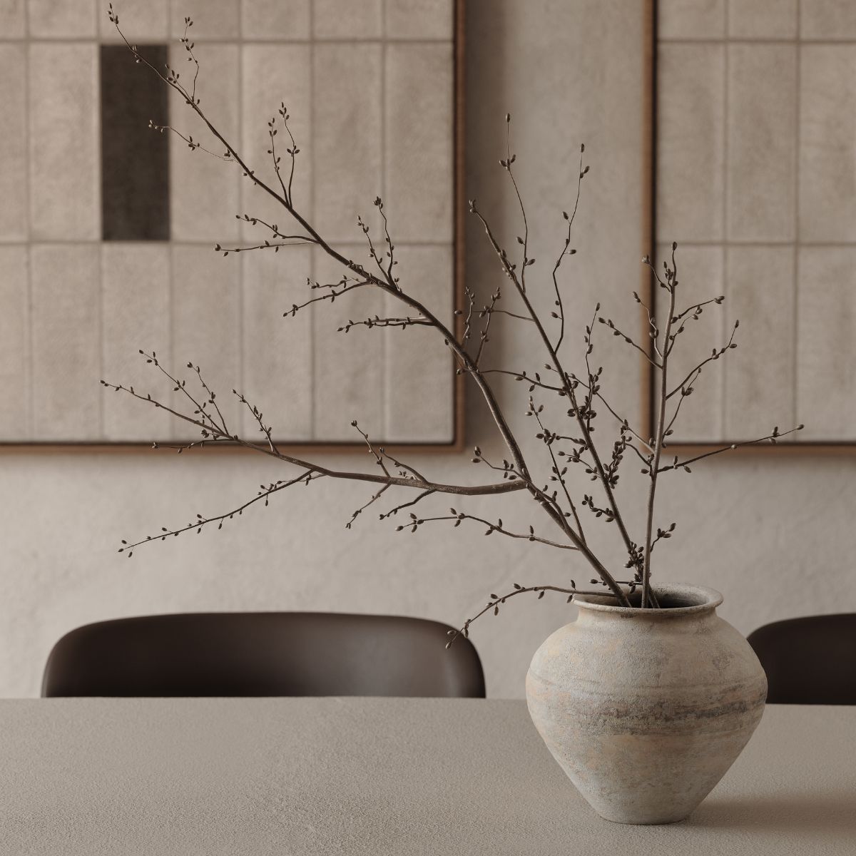
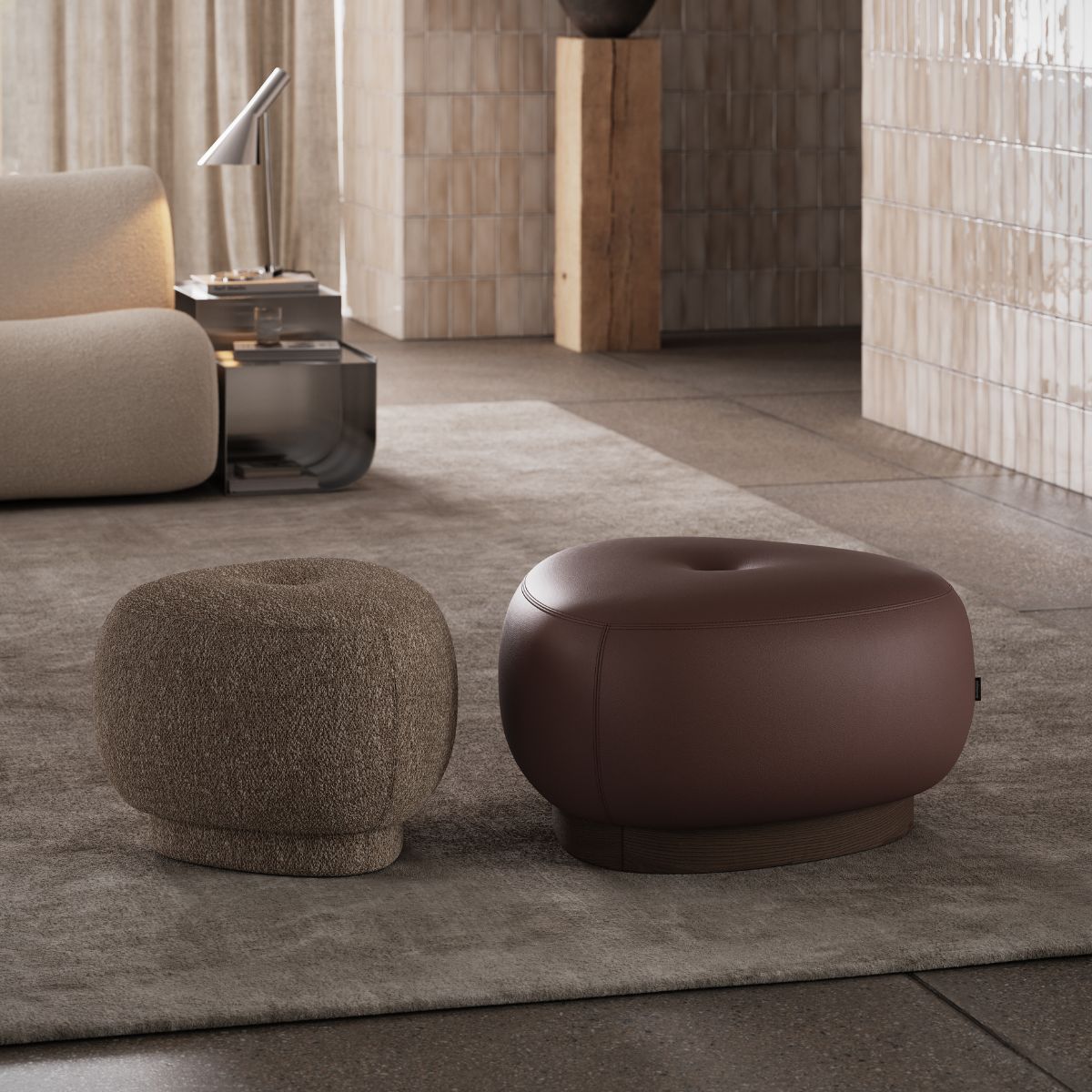
Natural materiality – raw wood, unlacquered brass, honed stone – needs a colour partner that doesn’t compete, and brown, being the colour of bark, hide and soil, is the most literal match available. Comfort-focused living has pushed designers toward colours that feel enveloping rather than clinical. And after more than a decade of cool grey dominance, undertones are starting to read as sterile – the shift away from cool greys is, in many ways, simply warmth reasserting itself.
Trend or Timeless?
Every few years, a colour claims this exact territory. Millennial pink did it. Emerald green did it. Sage green has been fading from spec sheets after a very fast rise. Each followed a familiar arc: a strong debut, heavy visibility on social platforms, rapid adoption in fast-turnaround retail, and then a slow retreat as the next colour takes its place.
What separates a colour that fades from one that endures has less to do with the colour itself than with what it’s tied to. Trend colours are usually tied to a specific cultural moment – a runway season, a viral interior. Enduring colours are tied to something structural instead: a material, a light condition, an architectural style that isn’t going anywhere. Navy endures because it behaves like a neutral. Chocolate brown has a genuine chance at longevity for a similar reason – it isn’t really a colour statement so much as an extension of natural materials that have never gone out of style.
This is the distinction worth specifying against: not popularity, but context. A colour chosen because it suits the architecture, the light and the materials already in a space has a longer life than one chosen because it was trending the month the client signed off on finishes.
Why Upholstery Changes Everything
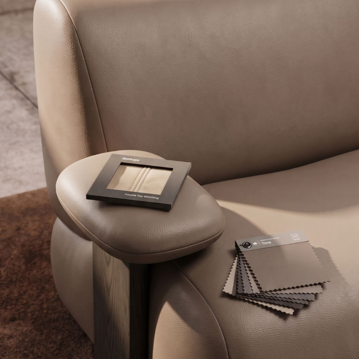
Colour theory written for walls doesn’t transfer cleanly to upholstery and this is where a lot of chocolate brown specifications go wrong. A wall is flat, evenly lit and finished in a single sheen. Upholstery is none of those things.
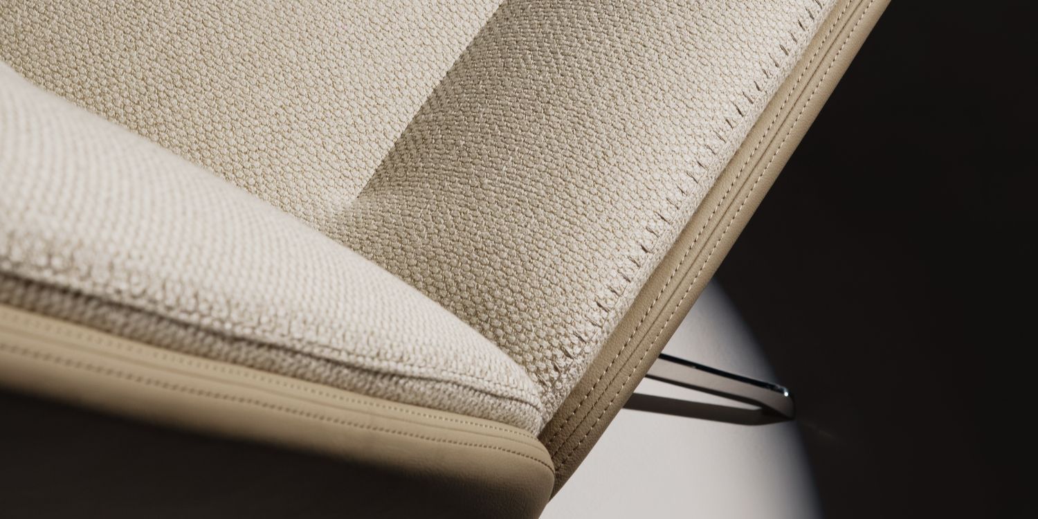
Texture breaks a solid colour into thousands of tiny highlights and shadows, so the same chocolate brown looks different in bouclé versus smooth leather. Light absorption matters more on a sofa than on a wall – darker fabrics pull light in rather than bouncing it back, changing how a room feels through the day. Fabric pile adds direction and depth, giving a single colour multiple readings within one piece depending on viewing angle. Material richness – the weight and hand-feel of a fabric – communicates quality in a way flat colour alone cannot. Add it all together and you get visual warmth: upholstered brown almost always reads warmer and more alive than painted brown because it’s doing more optical work per square metre.
Chocolate brown, in other words, isn’t one colour decision – it’s a colour-and-material decision made together. Get the material wrong and even a well-chosen shade can look flat or dated.
Where Chocolate Brown Works Best
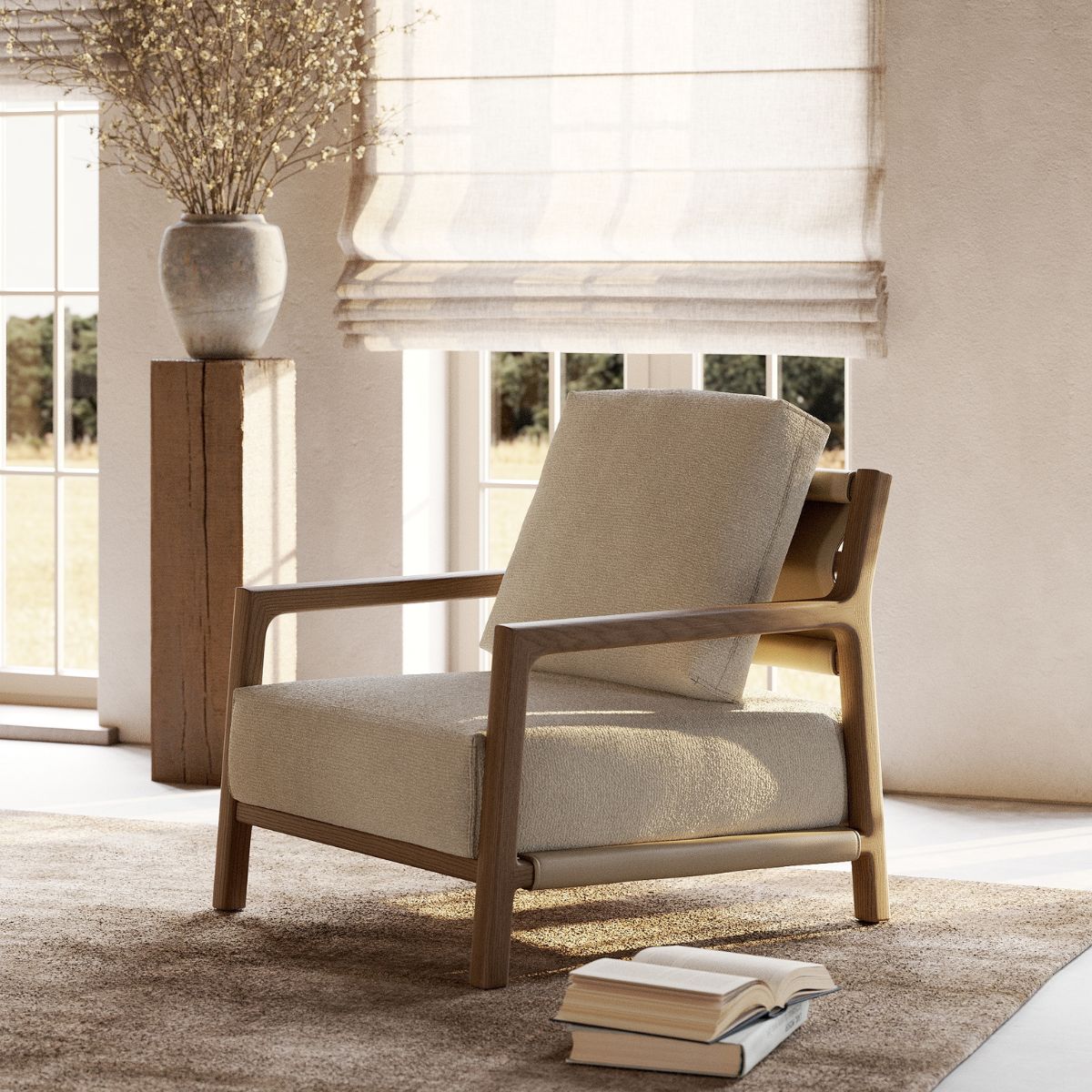
Scale changes how a colour reads. On a sofa, brown becomes the dominant note in the room, so the material carries real weight – a bouclé or textured weave keeps a large piece like the Giorgio Sofa feeling soft and current, where a flat, low-pile fabric in the same colour can start to look like it’s absorbing the room. Lounge chairs have more room for boldness, occupying less visual real estate; a piece like the Elliot Armchair or Alton Armchair can carry a richer, glossier brown – leather or heavier velvet – without overwhelming the space.
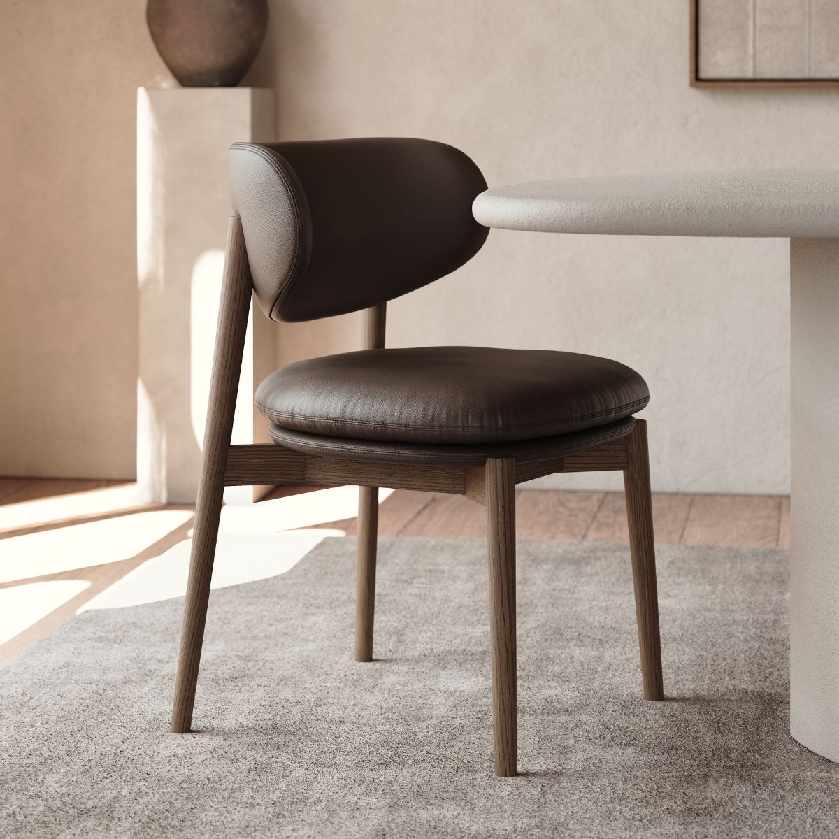
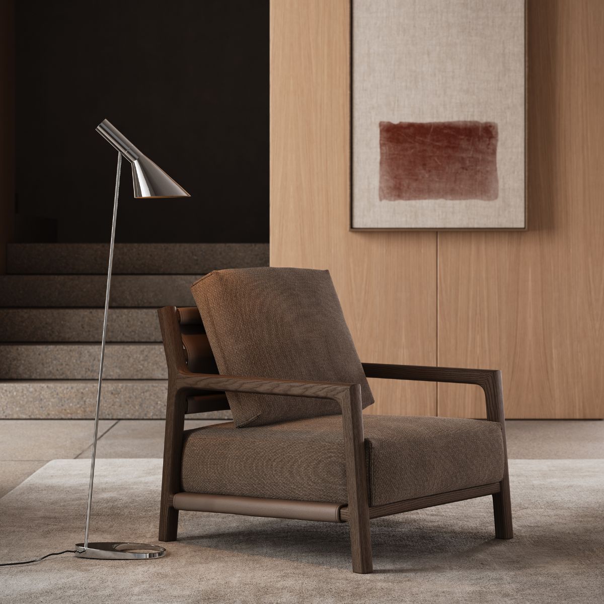
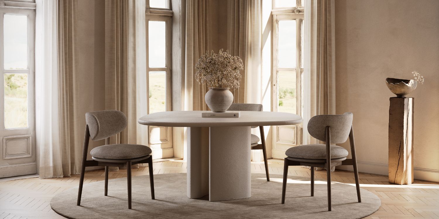
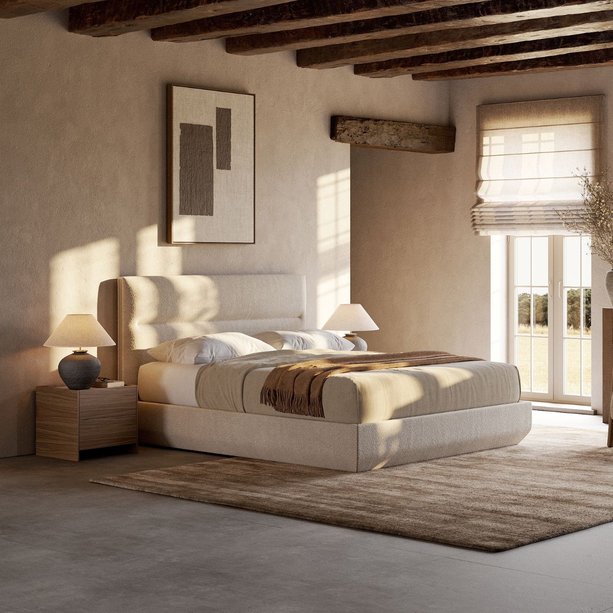
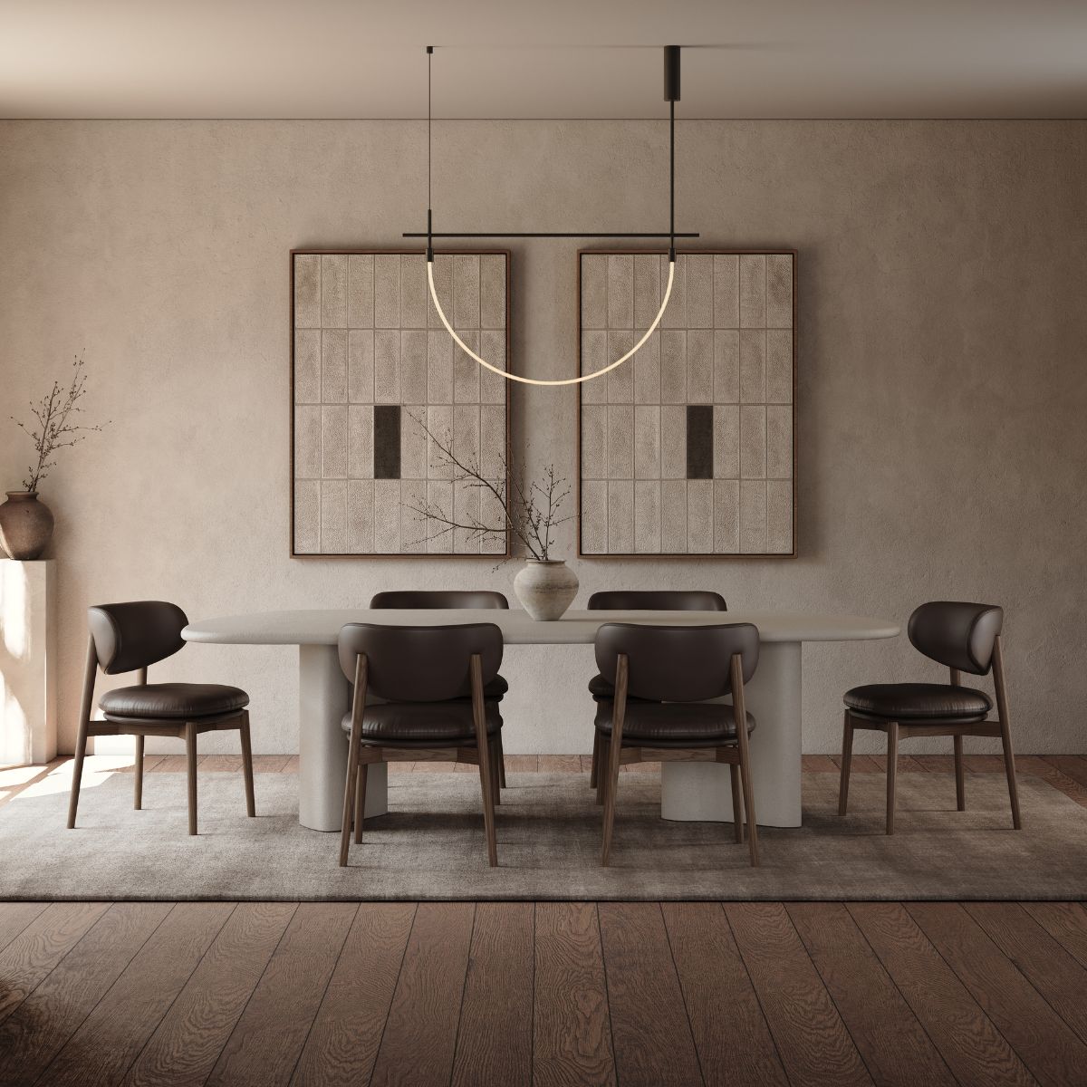
Dining chairs work well in brown when used in repetition; a run of chairs around a table, the Harvey Dining Chair being a useful reference point, creates rhythm rather than mass. Headboards are intimate and softly lit, making them one of the most forgiving places to be bold. Ottomans and poufs work as small, grounding accents for a room that wants warmth without committing to a large piece. And in hospitality seating, where durability matters as much as looks, brown’s ability to hide wear while still photographing well makes it practical, not just fashionable.
The general principle: the larger the surface, the more the material needs to do to keep the colour feeling light rather than heavy.
Materials That Elevate Chocolate Brown
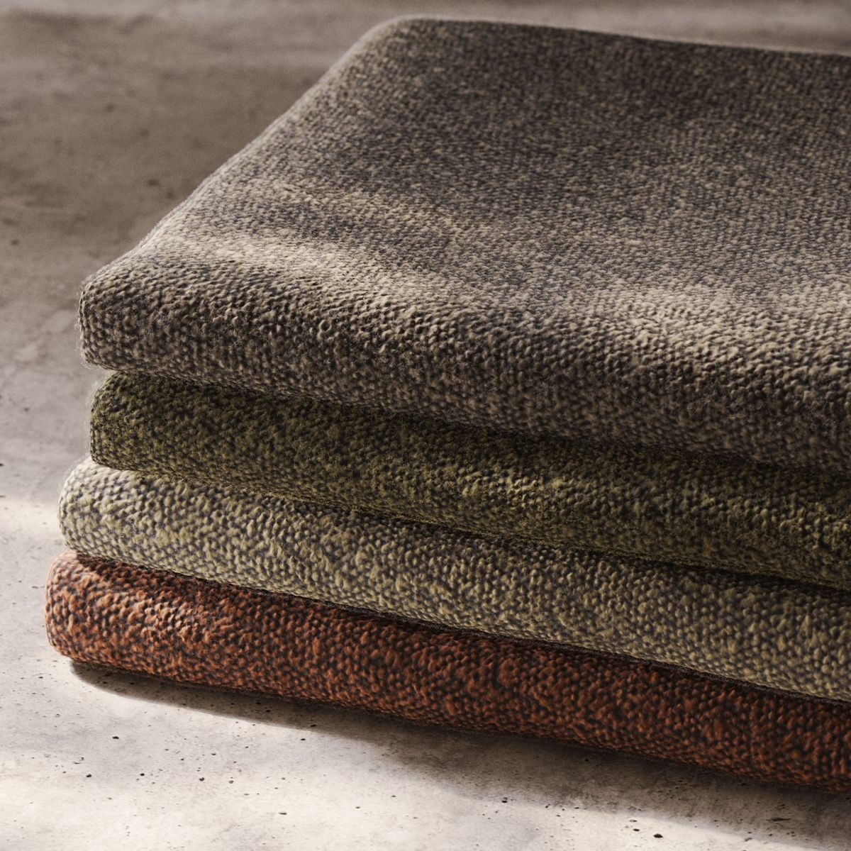
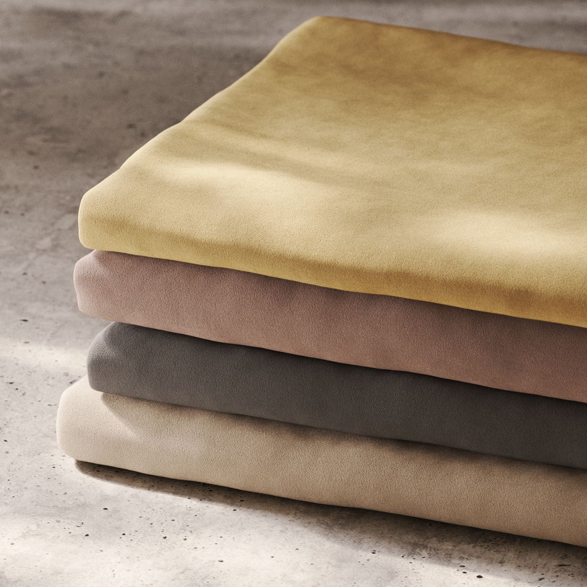
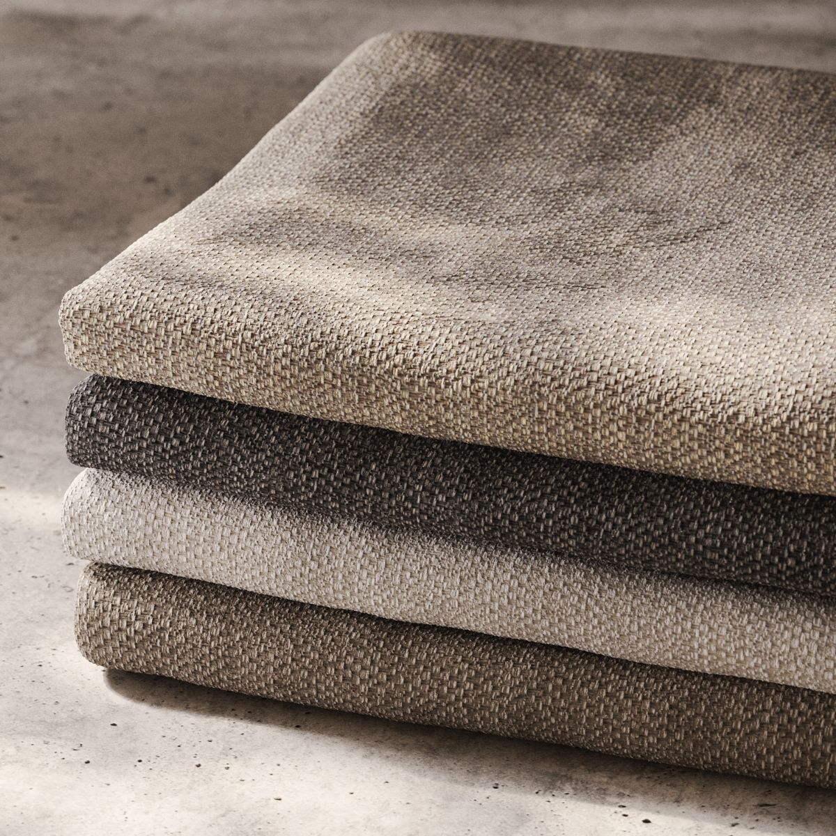
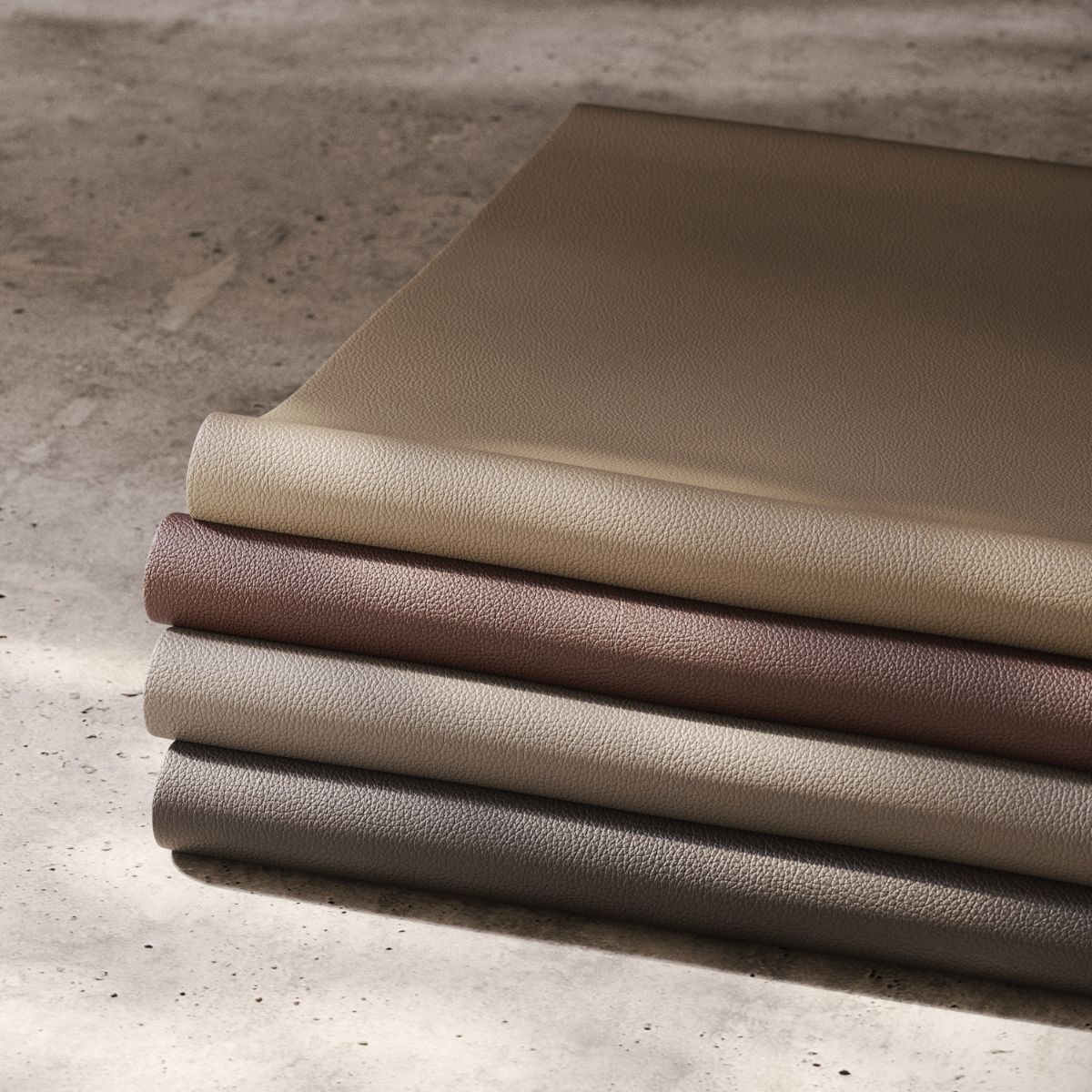
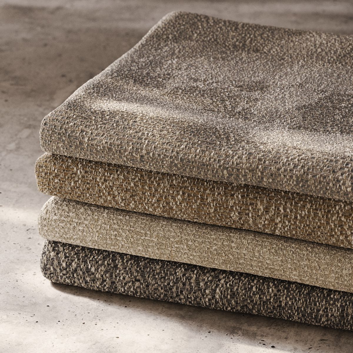
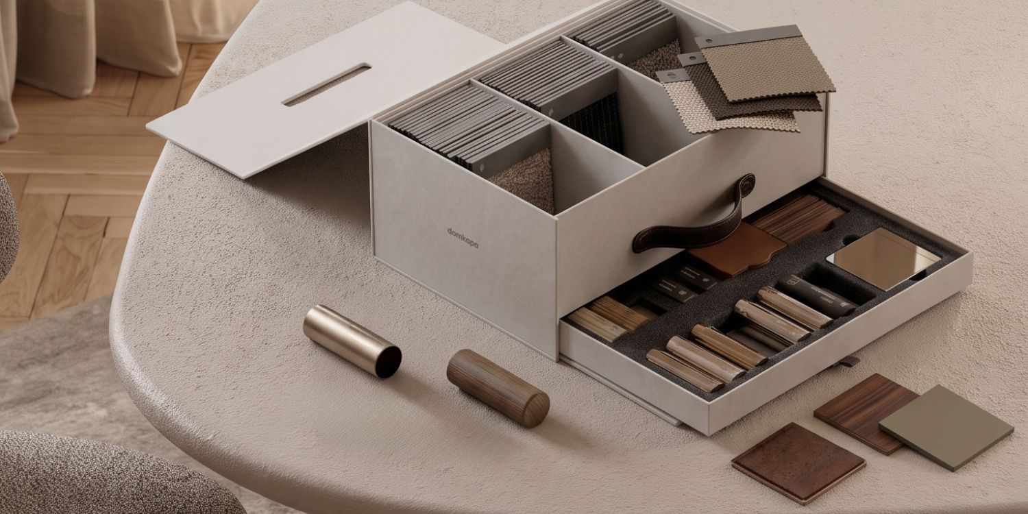
The fabric carries as much of the decision as the colour itself. Bouclé softens chocolate brown, breaking up its density with visible texture for a relaxed, contemporary feel suited to residential living spaces. Velvet does the opposite – it deepens the colour and adds sheen, which is why it turns up so often in hospitality settings where a little drama is welcome. Linen blends mute the colour further, producing a matte, natural finish that tends to age the most gracefully of all the options. Leather is the material most associated with brown historically and remains the safest long-term choice for designers wary of trend fatigue – it reads as classic and improves with a patina rather than simply wearing out. Wool textures sit between bouclé and linen, offering tactile richness without excessive sheen.
As a rule, matte and textured materials push chocolate brown toward timeless; high-sheen, uniformly smooth materials push it toward trend-driven. Neither is wrong, but the choice should be deliberate.
What to Pair It With
Chocolate brown rarely works alone. Warm ivory softens its density and keeps a scheme feeling airy. Sand and oatmeal build tonal, monochromatic warmth that reads as considered rather than matched. Olive green brings the earth-palette connection full circle. Walnut creates tonal harmony between furniture and upholstery and travertine grounds a scheme architecturally. Brushed brass introduces warmth in metal without competing for attention, while a small amount of black – in lighting, frames or hardware – stops a brown-dominant room from feeling flat by giving the eye somewhere sharp to land.
The common thread: one warm neutral, one natural material reference, one grounding accent. Interiors that lean too heavily into brown-on-brown, without any counterpoint, are the ones most likely to feel heavy and, eventually, dated.
A Designer’s Framework for Specifying Trend Colours
Before committing a client to any colour currently having a moment, it’s worth running it through a short set of questions.
Colour Specification Checklist
- Does the colour suit the architecture? Consider proportions, ceiling height and existing finishes before the fabric swatch.
- Will it age gracefully? Check how the material – not just the colour – is likely to wear, fade and patina.
- Does it support the client’s lifestyle? A high-traffic family room and a formal lounge carry the same colour very differently.
- Can it adapt to future styling changes? A genuinely versatile neutral should still work if the client’s accent palette changes in five years.
- Is it timeless because of the palette or simply fashionable? Be honest about whether the choice is rooted in materiality and lightness or in what’s circulating on social platforms.
A colour that answers all five confidently is a safe long-term specification. One that only answers the last is worth a second look before it goes on the presentation board.
When Chocolate Brown Feels Timeless vs. When It Feels Trend-Driven
Factor |
Feels Timeless |
Feels Trend-Driven |
|---|---|---|
| Material | Leather, wool, linen blends with visible texture | High-sheen, uniform synthetic finishes |
| Application | Considered accents – chairs, headboards, poufs | Brown used uniformly across every surface |
| Pairing palette | Warm neutrals, natural materials, one grounding dark note | Brown paired only with other trend colours |
| Lighting context | Rooms with strong natural light | Low-light rooms with no daylight to activate warmth |
| Undertone matching | Coordinated with existing warm materials | Clashing against cool-toned finishes |
| Reason for choice | Suits the architecture and materials already present | Chosen primarily because it’s currently popular |
Chocolate brown upholstery is neither an automatically timeless choice nor an inevitable trap. It’s a colour that rewards the same rigour any serious material specification deserves: attention to light, proportion, texture and the materials already at play in a space. Used with restraint, in materials that suit the architecture and balanced against the right neutrals, chocolate brown has every reason to outlast the current design cycle. Used simply because it’s what everyone is specifying this year, it will likely age the way every colour-of-the-moment eventually does.
The real skill isn’t predicting which colour will still be fashionable in five years. It’s building a case for a colour based on principles – proportion, light, materiality, and texture – that hold up regardless of what’s trending next season. Chocolate brown happens to hold up unusually well against that test, which is worth more in a client presentation than any trend forecast.
YOU MAY ALSO LIKE: COM vs. House Fabric: Which Upholstery Option Is Right For Your Project?
We are working every day to bring you the most stylish ideas to fulfil your inspiration and to create the best interior design projects, so feel free to follow our Instagram Page and subscribe to our newsletter.